Still Ground Organic Coffee
June 2026 | Packaging Design | Brand Creation & Identity
Still Ground is a crafty coffee brand and café rooted in sustainability, craftsmanship, and a deep respect for the land. Built around the belief that great coffee starts from the ground up, the brand celebrates ethical growing and harvesting practices, recognizing that healthy soil is the foundation of really great coffee.
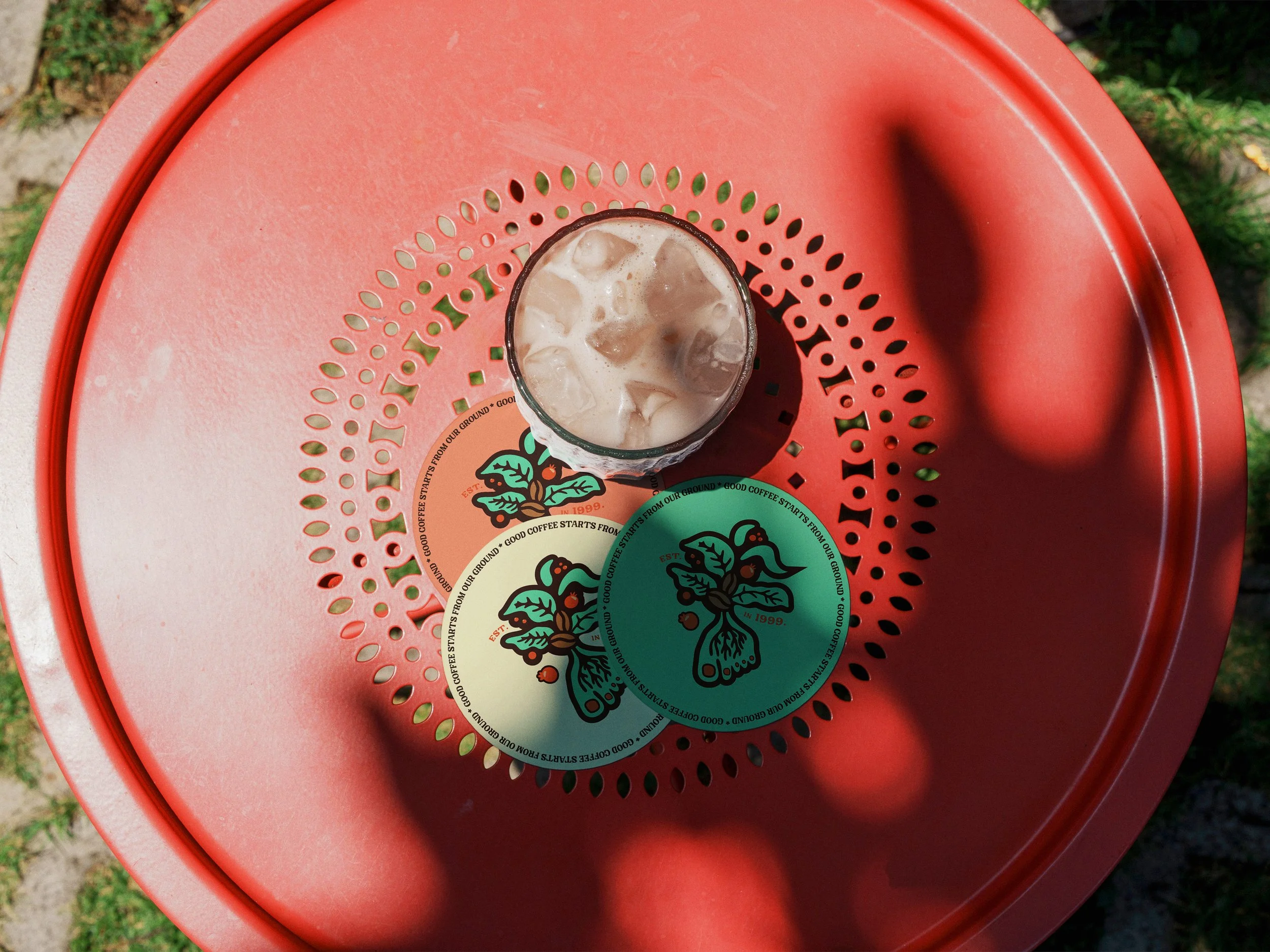
The Logo & Branding
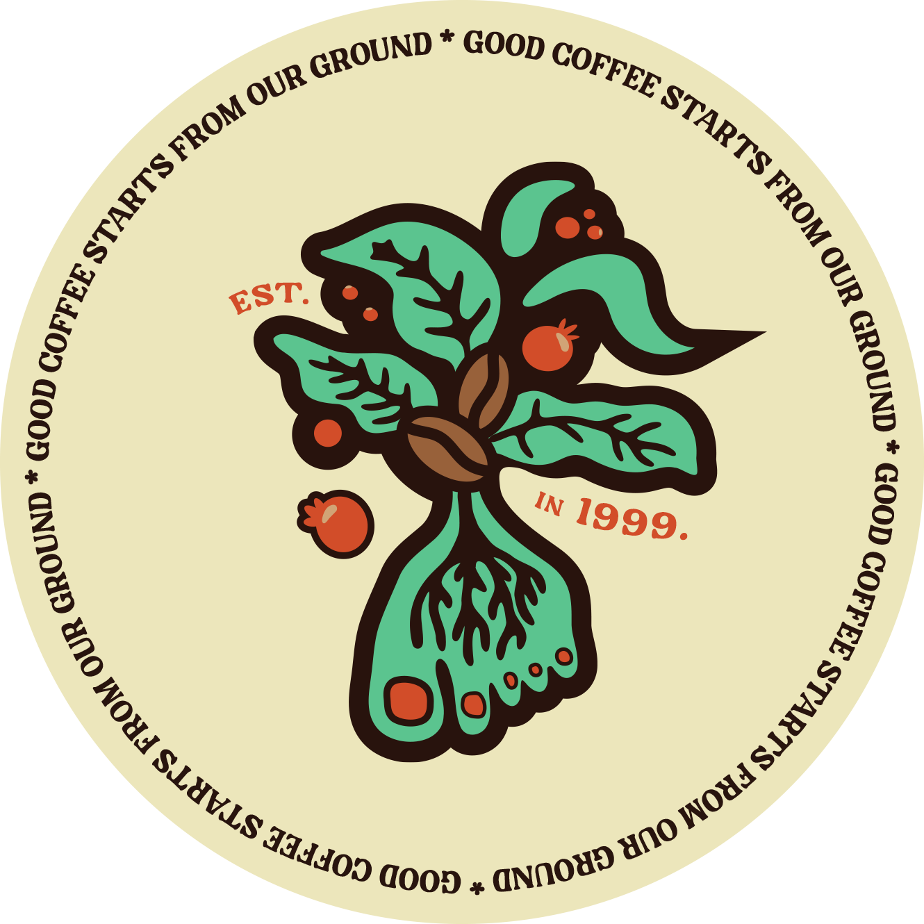
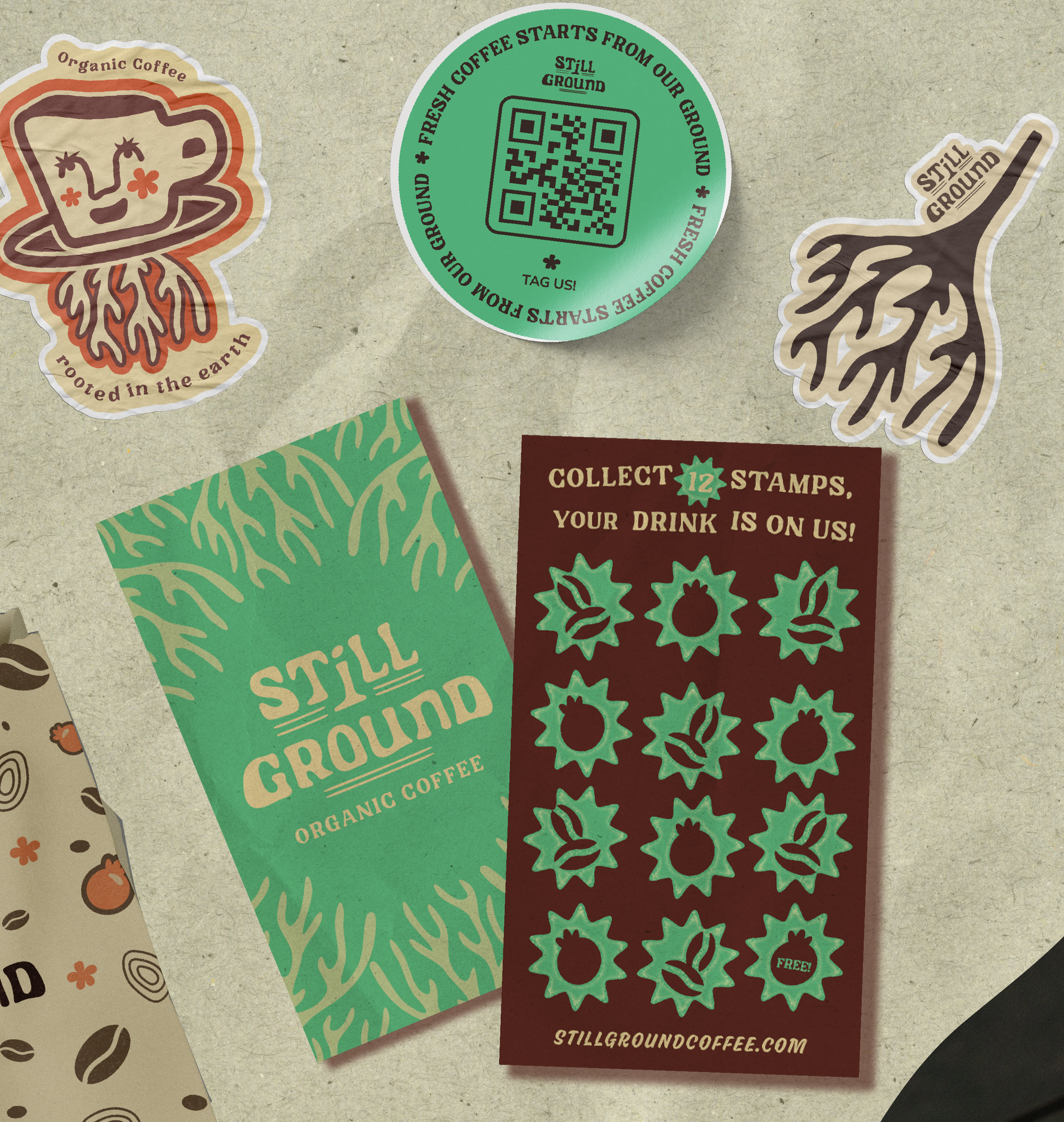
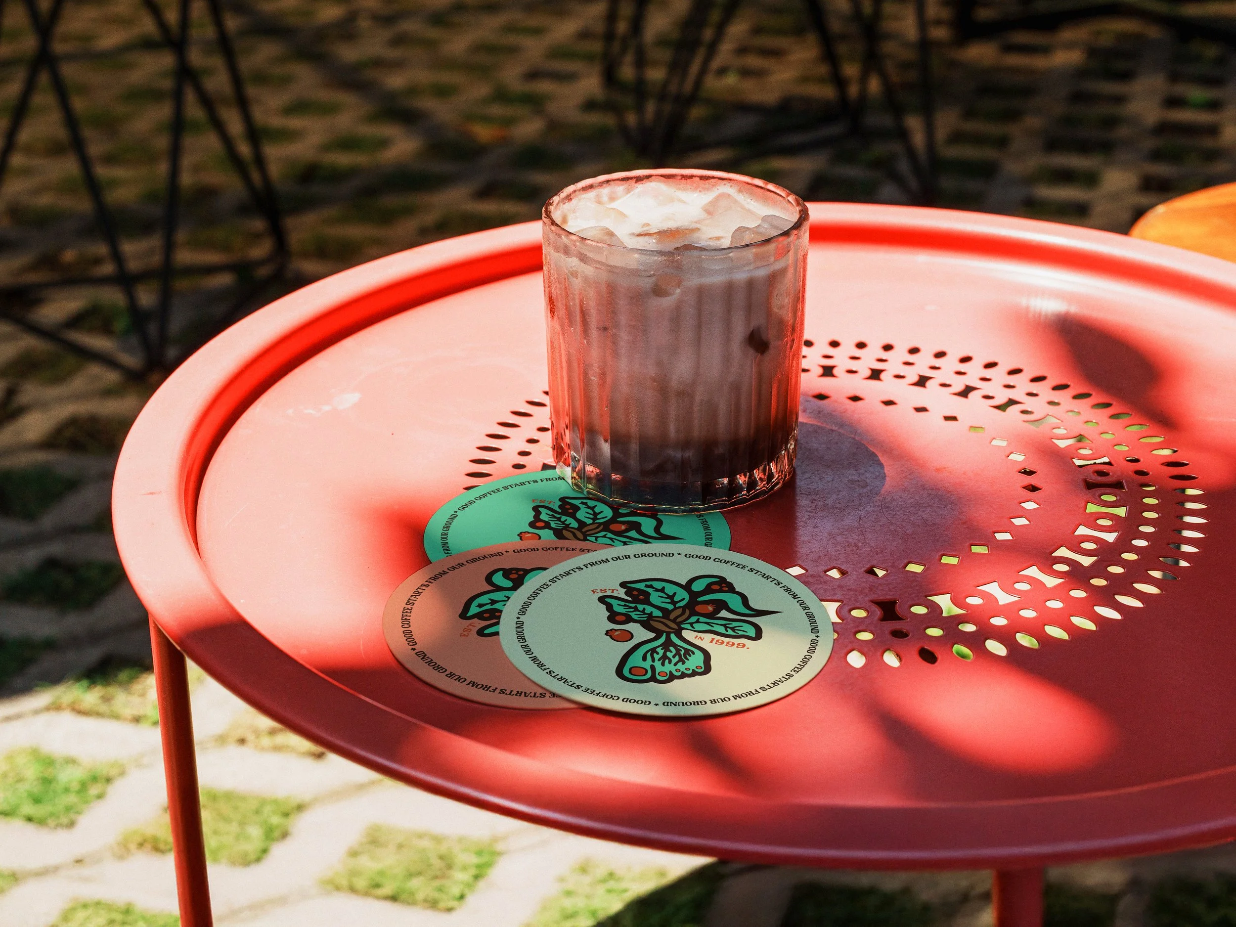
The logo and visual identity draws inspiration from the vibrant red of ripe coffee cherries, the natural forms of the coffee plant, and the idea of grounding ourselves in nature
(Think of taking a moment to touch grass, feel the earth beneath your feet, and slow down.)
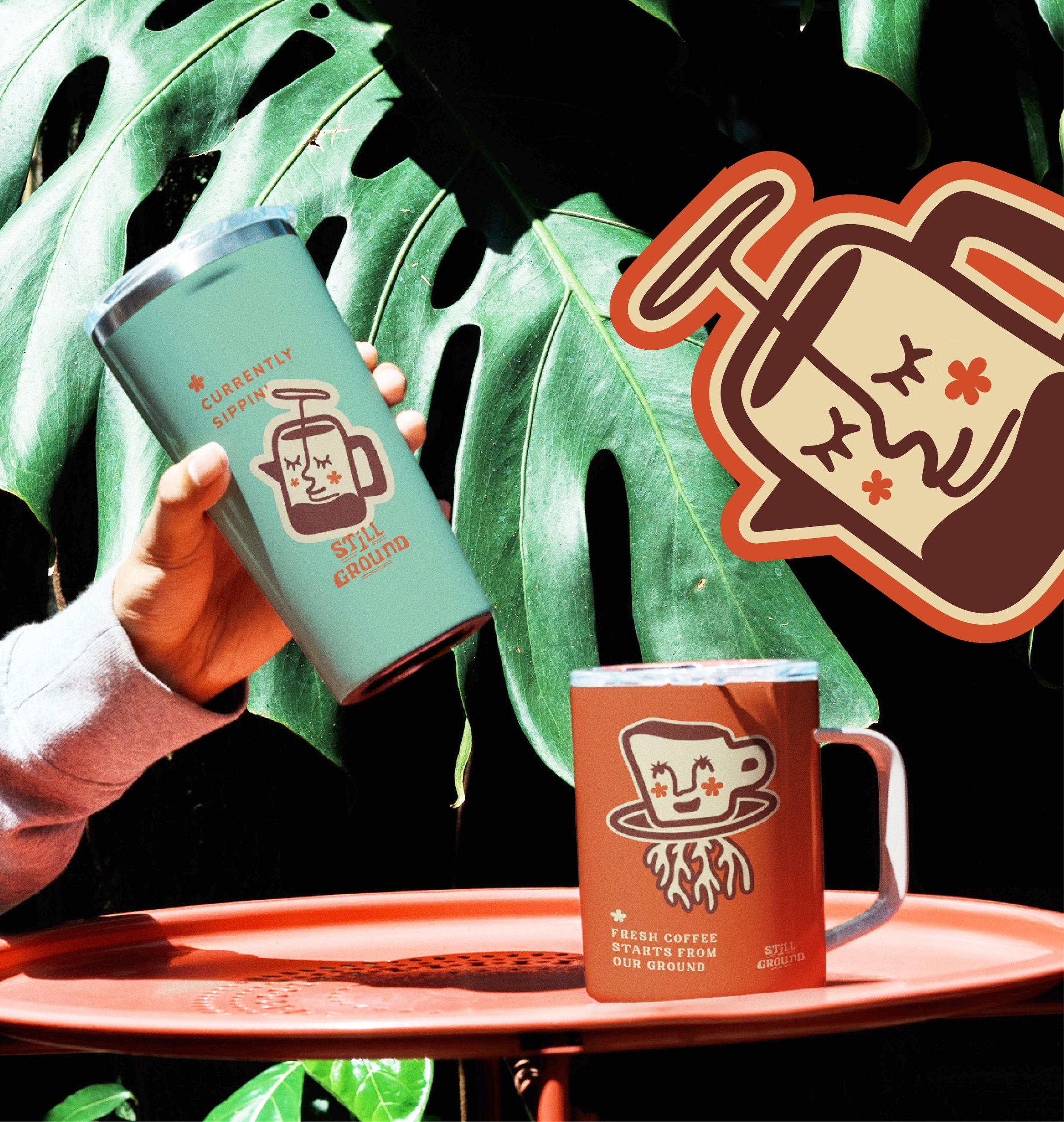
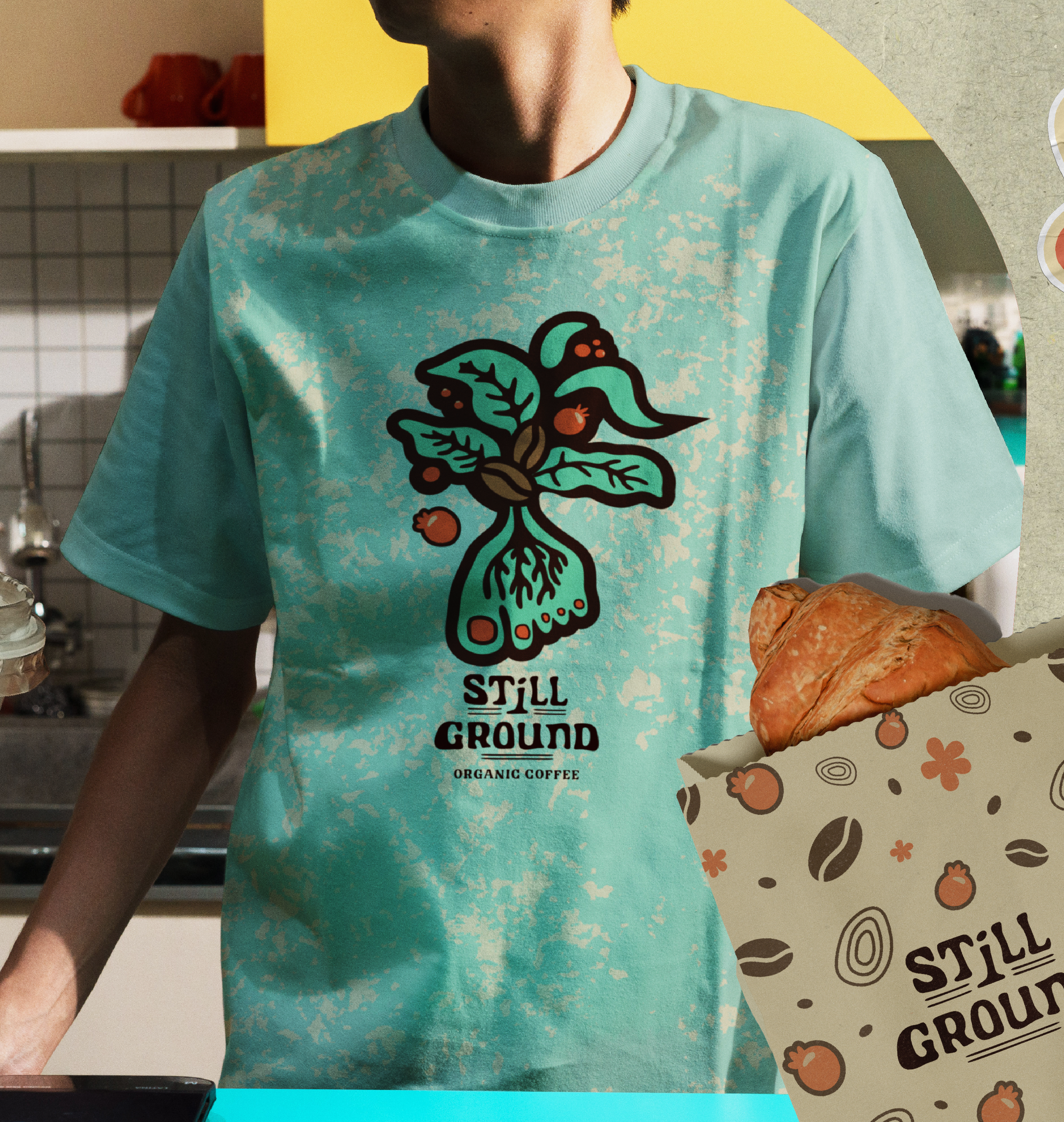
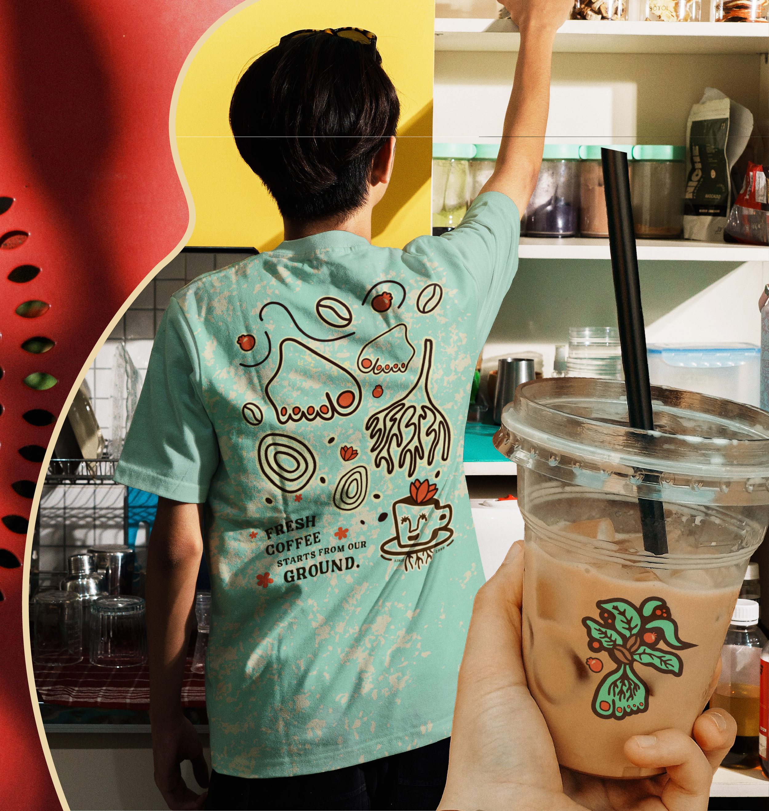
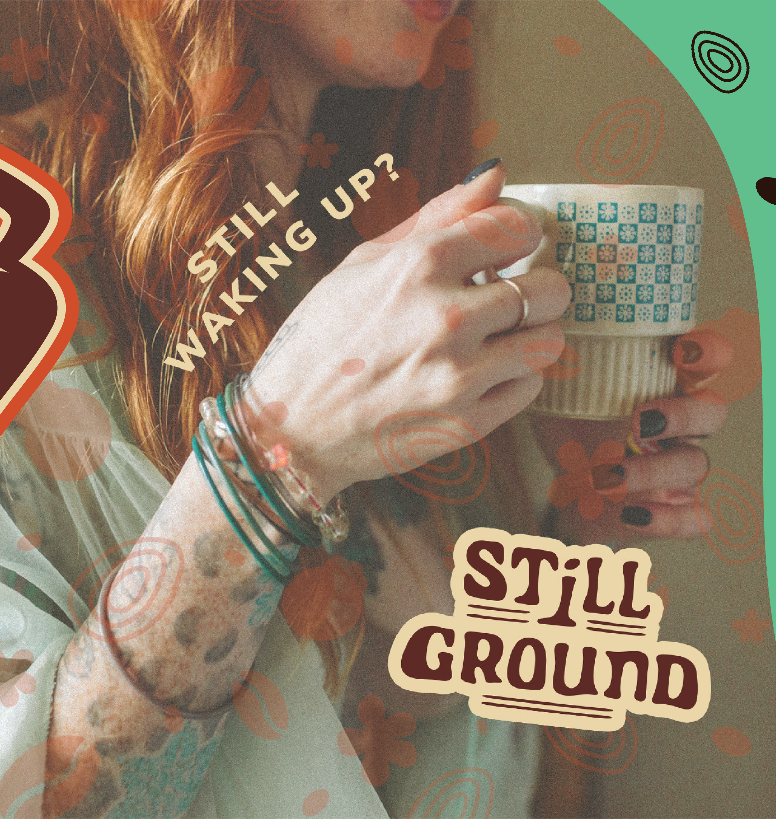
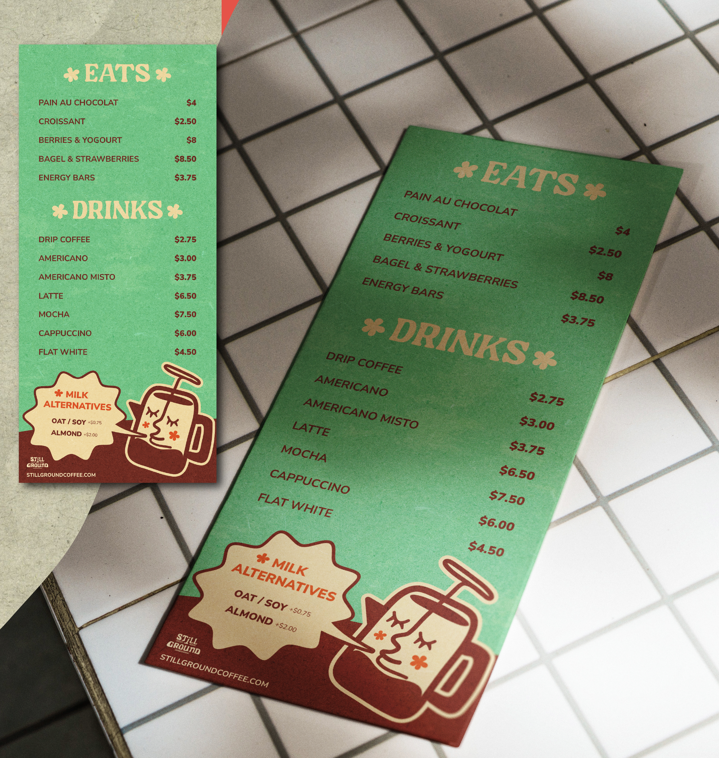
To bring that feeling to life, I paired a bold, modern colour palette with organic hand drawn illustrations and playful brand elements. The result is a brand that feels fresh, approachable, and full of character rooted in it’s products origin; the earth.
The Logo & Branding
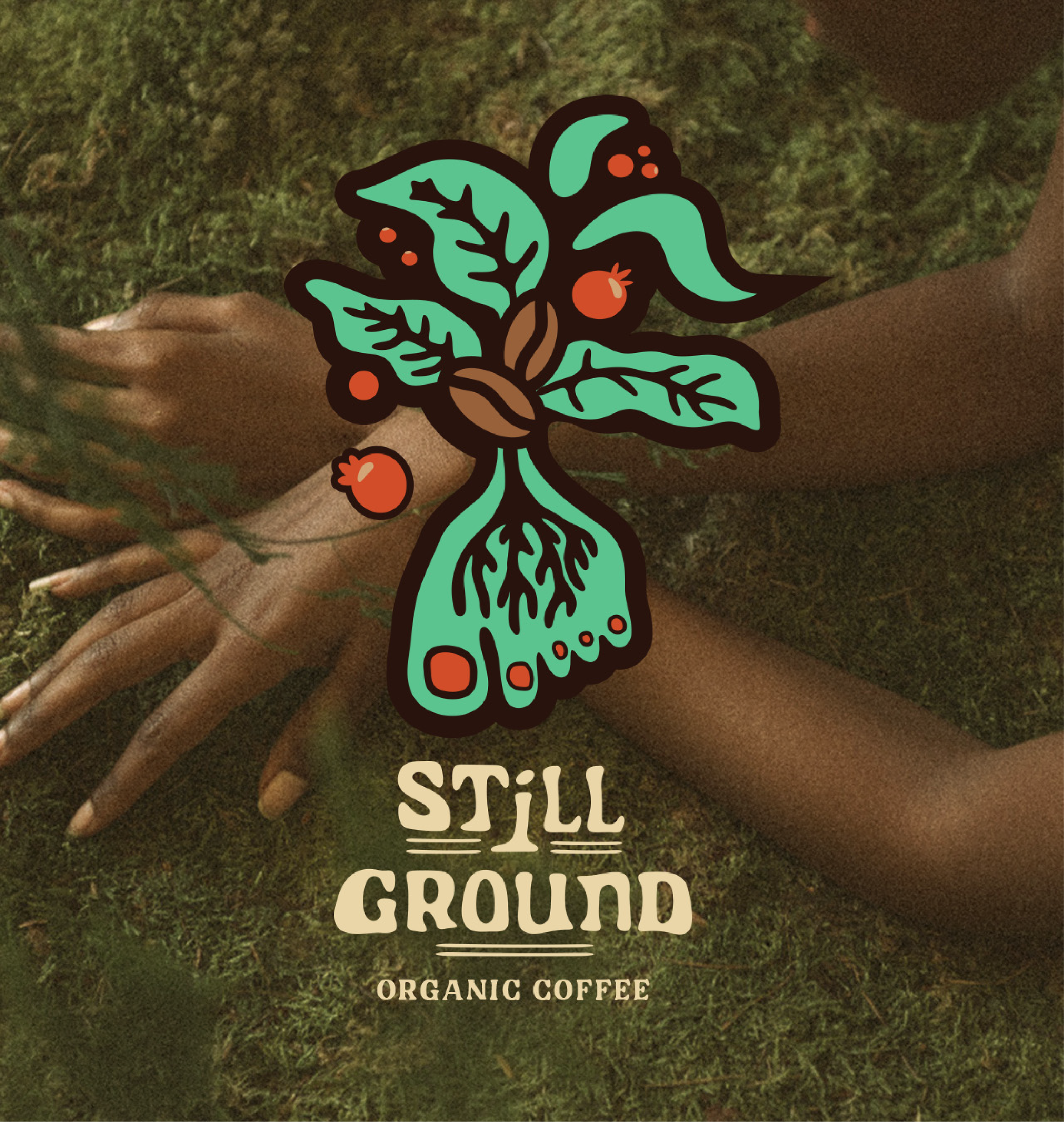
The logo and visual identity draws inspiration from the vibrant red of ripe coffee cherries, the natural forms of the coffee plant, and the idea of grounding ourselves in nature
(Think of taking a moment to touch grass, feel the earth beneath your feet, and slow down.)
To bring that feeling to life, I paired a bold, modern colour palette with organic hand drawn illustrations and playful brand elements. The result is a brand that feels fresh, approachable, and full of character rooted in it’s products origin; the earth.
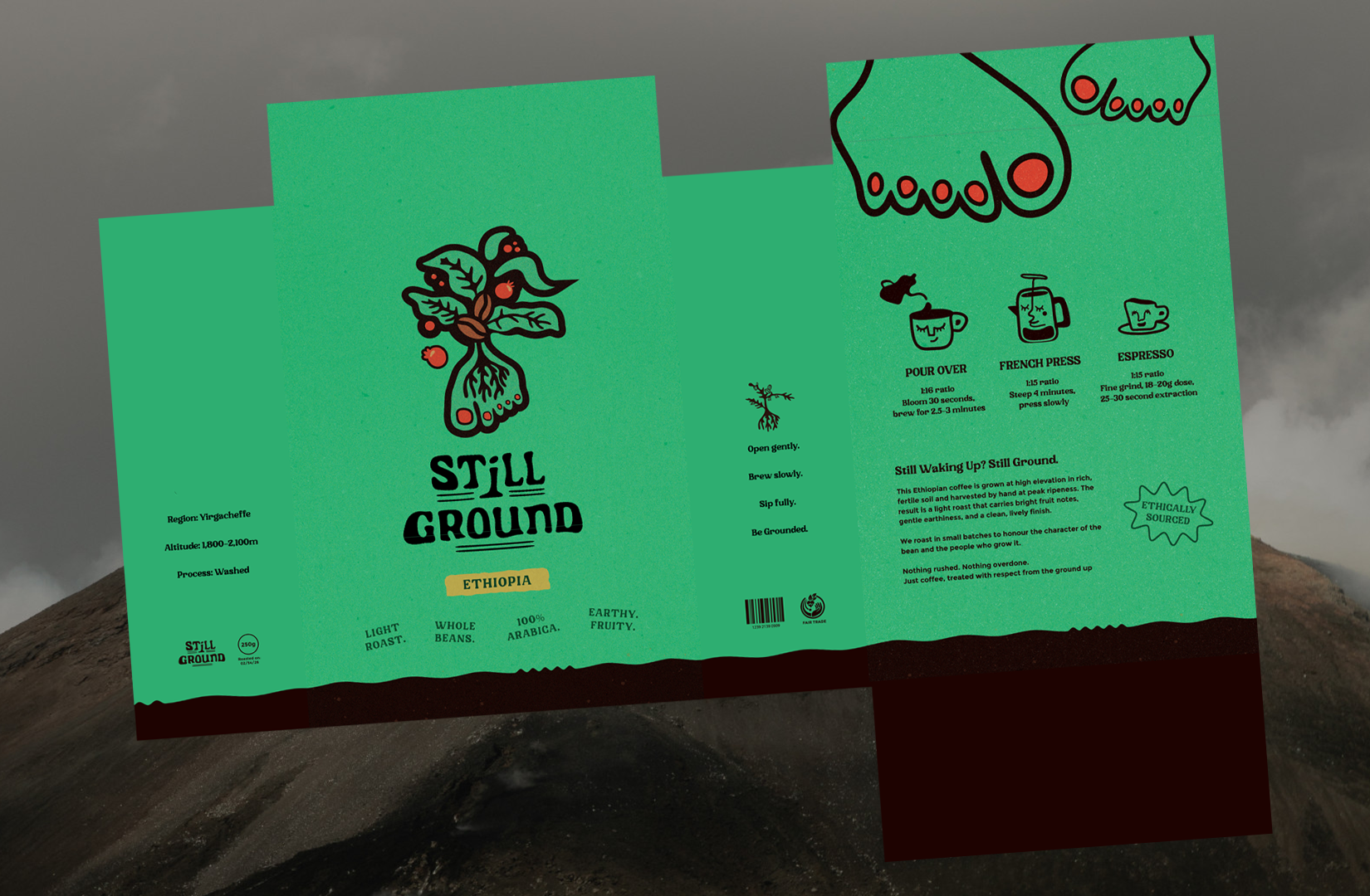
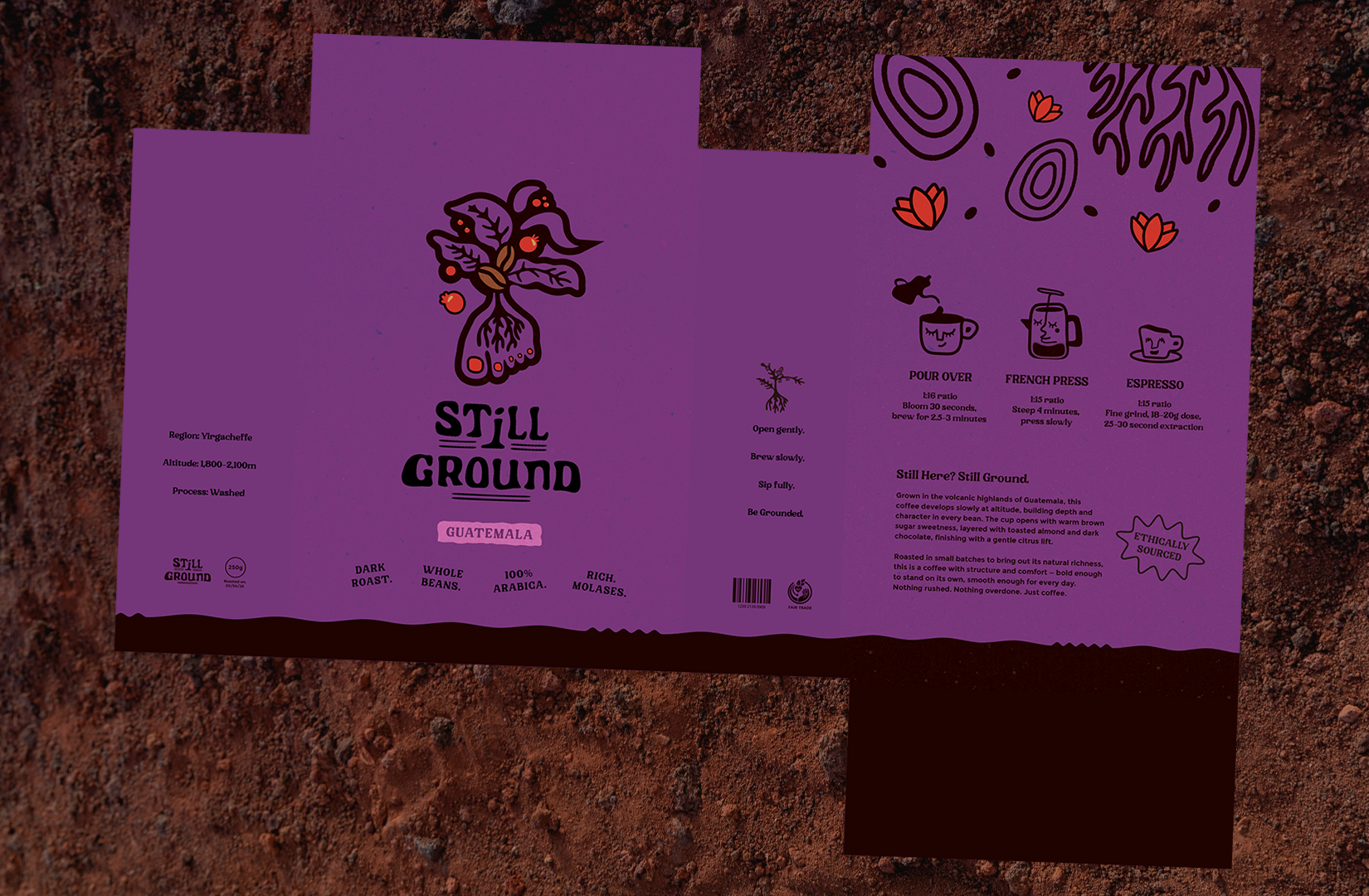
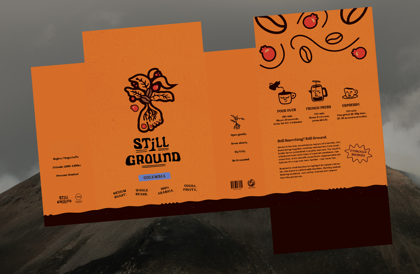
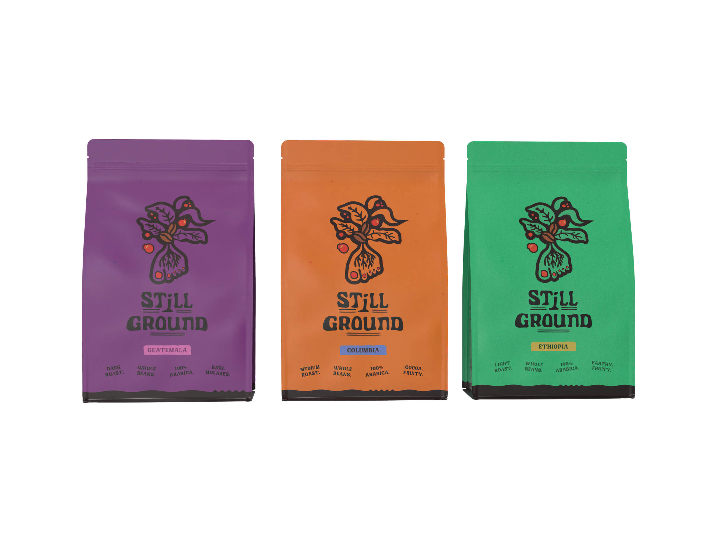
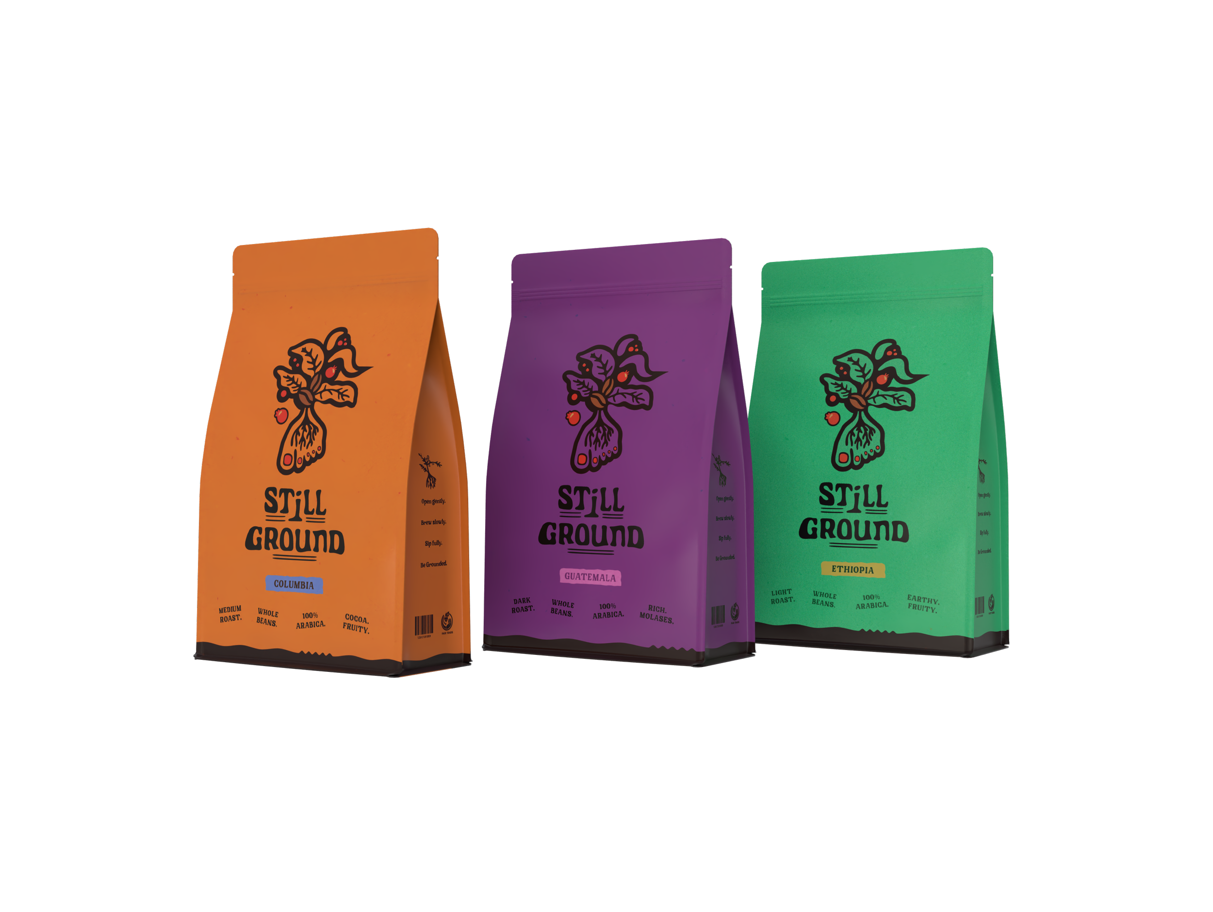
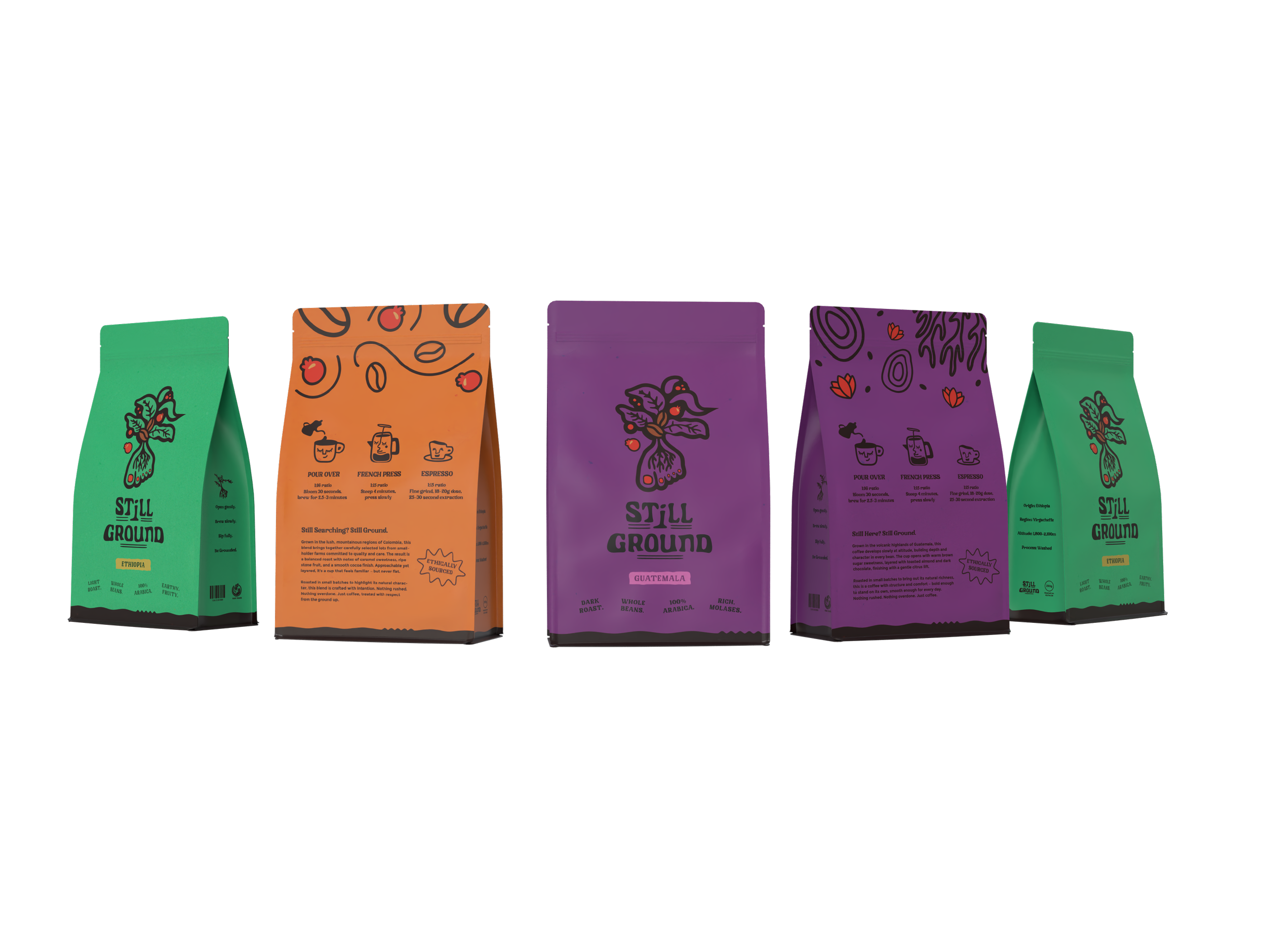
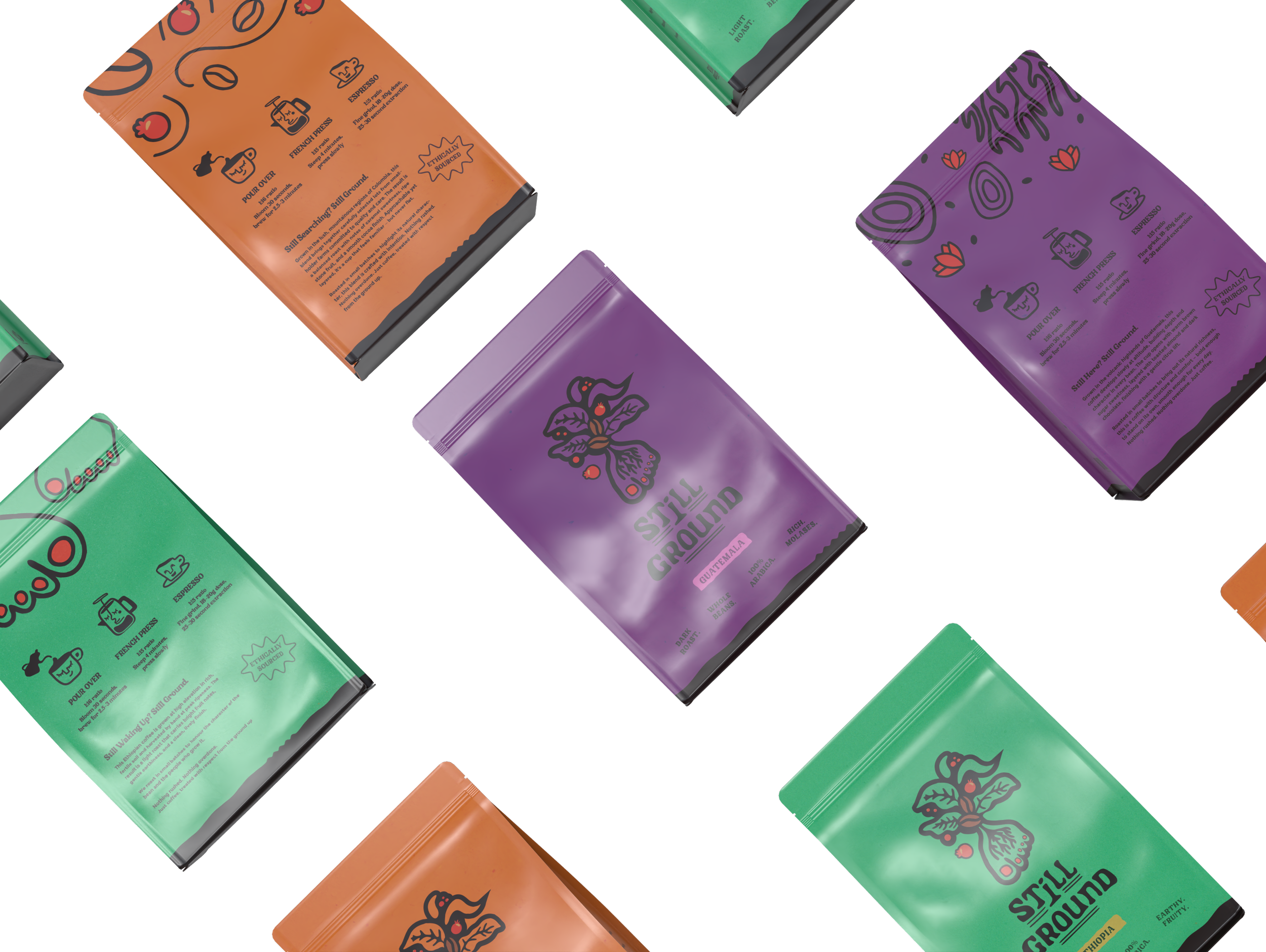
The Packaging
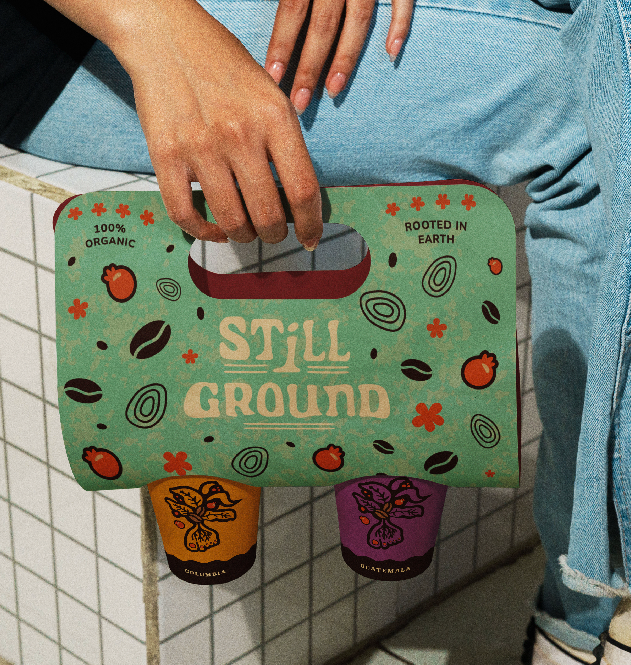
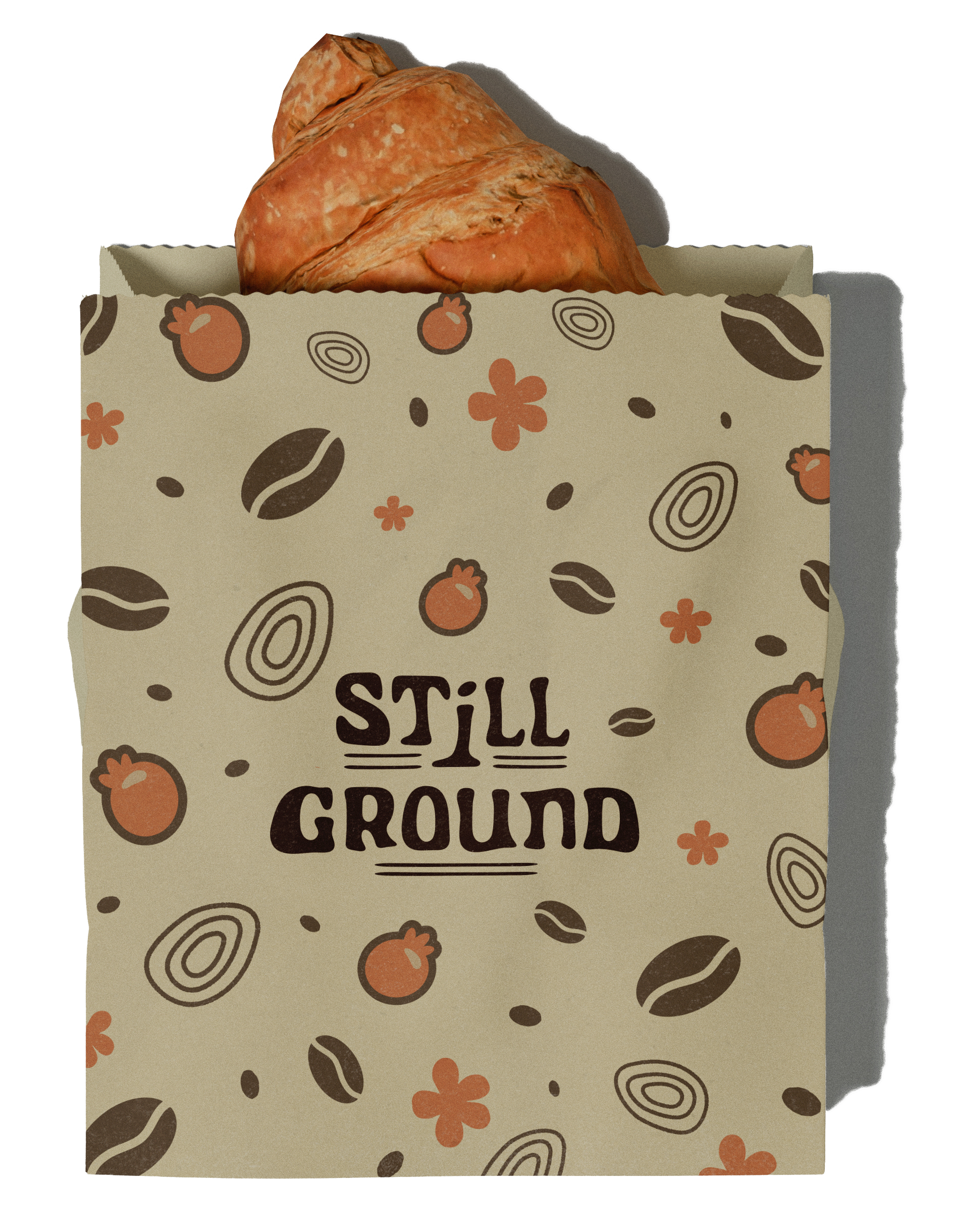
The logo and visual identity draws inspiration from the vibrant red of ripe coffee cherries, the natural forms of the coffee plant, and the idea of grounding ourselves in nature
(Think of taking a moment to touch grass, feel the earth beneath your feet, and slow down.)
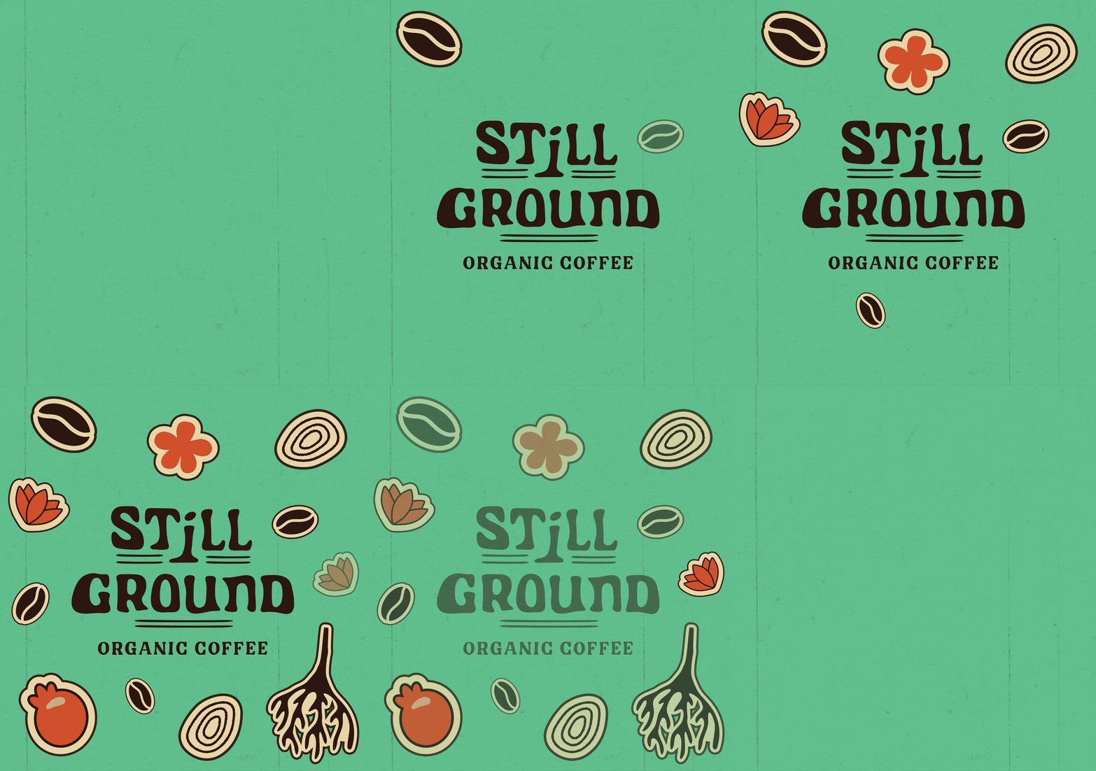
To bring that feeling to life, I paired a bold, modern colour palette with organic hand drawn illustrations and playful brand elements. The result is a brand that feels fresh, approachable, and full of character rooted in it’s products origin; the earth.

Let’s Connect!
Got an idea brewing? A brand waiting to bloom? A package that deserves a spot on the shelf? Fill out the form below and tell me what you're dreaming up, I'd love to help bring it to life.