Burnaby Tennis Club
March 2025 | Brand Creation & Logo Design
Burnaby Tennis Club is a non-profit society operating in partnership with the City of Burnaby. Without any brand guidelines or cohesive visual identity, the club required a full refresh of its branding system.
I developed a comprehensive brand style guide that introduced a modernized logo, clear typography, and an adaptable colour palette. The new identity was applied across a range of print and environmental materials—including coroplast signage, wayfinding, promo assets and brand materials, establishing a consistent and professional presence for the club.
They wanted a simple, timeless logo; nothing trendy or overly-designed. I went with a circular emblem style to create a sense of heritage and trust, a shape often associated with established clubs.
The badge-style mark feels both structured and sporty, reinforcing the club’s long-standing presence while remaining approachable. Paired with a clean sans serif typeface, it creates clarity and balances the traditional circular form to feel confident and versatile across signage, print and apparel.
The Logo & Brand Colours
The Logo & Brand Colours
They wanted a simple, timeless logo; nothing trendy or overly-designed. I went with a circular emblem style to create a sense of heritage and trust, a shape often associated with established clubs.
The badge-style mark feels both structured and sporty, reinforcing the club’s long-standing presence while remaining approachable. Paired with a clean sans serif typeface, it creates clarity and balances the traditional circular form to feel confident and versatile across signage, print and apparel.
GAME. SET. MATCH
GAME. SET. MATCH
The Style Guide
After developing the logo, it was important to create a style guide to ensure the identity would be used consistently across all touchpoints. A strong logo can quickly lose impact if applied inconsistently, so the guide establishes clear rules for typography, colour, spacing, and layout.
The style guide acts as a foundation for the brand by protecting its integrity while giving the club and future designers the tools they need to confidently apply the identity across signage, apparel, digital platforms, and print materials. It ensures the brand remains cohesive, recognizable, and timeless as it continues to grow.
The style guide acts as a foundation for the brand by protecting its integrity while giving the club and future designers the tools they need to confidently apply the identity across signage, apparel, digital platforms, and print materials. It ensures the brand remains cohesive, recognizable, and timeless as it continues to grow.
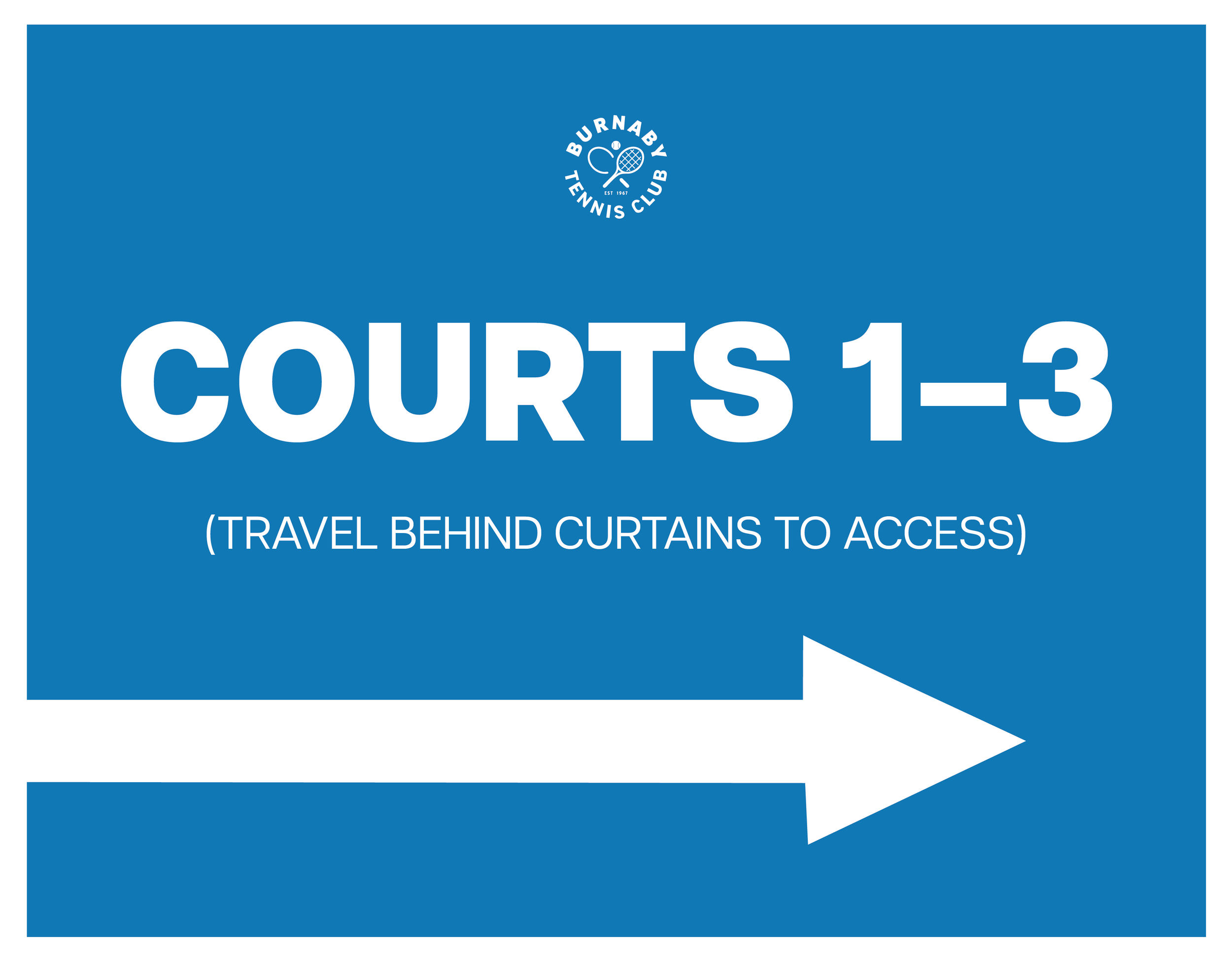
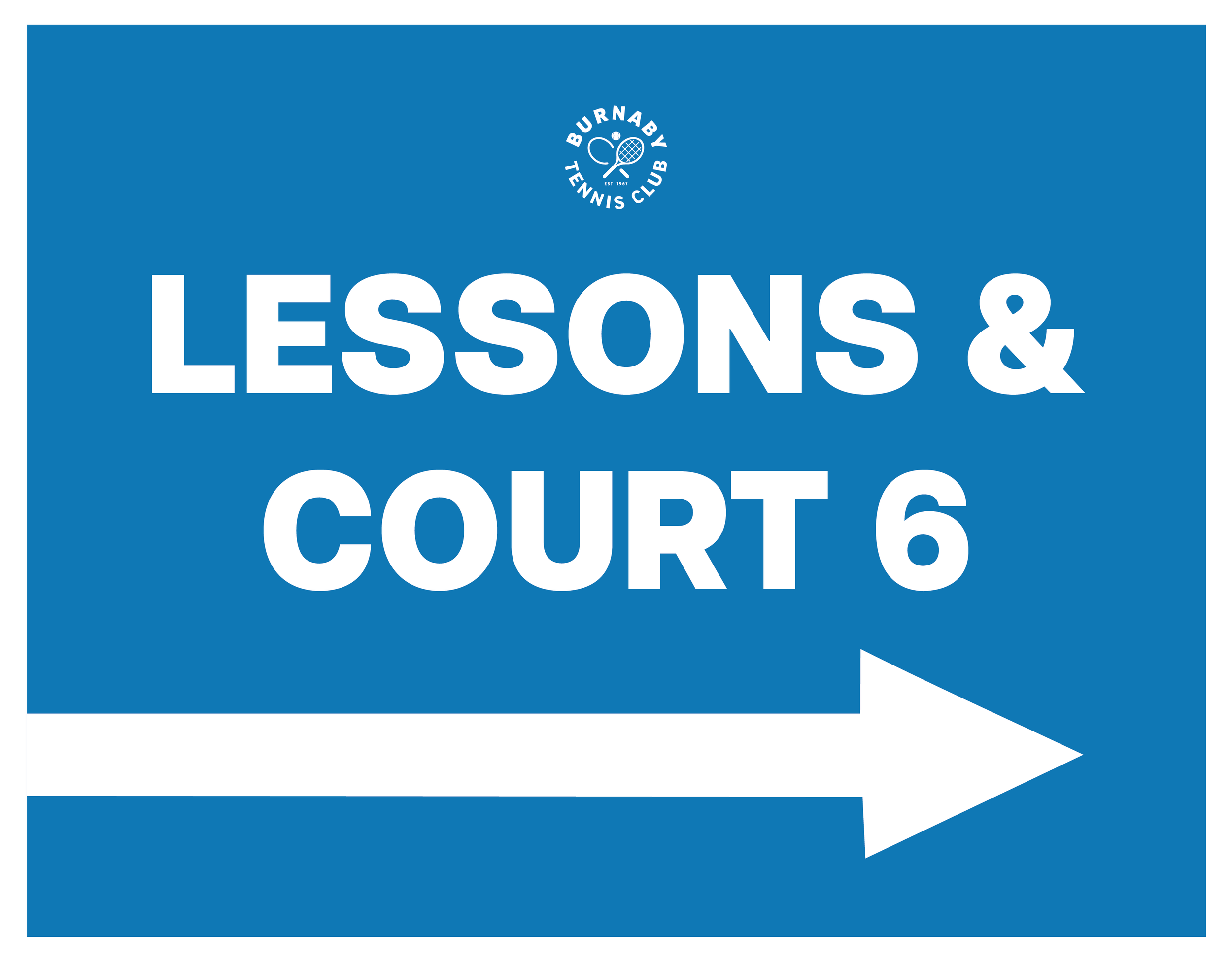
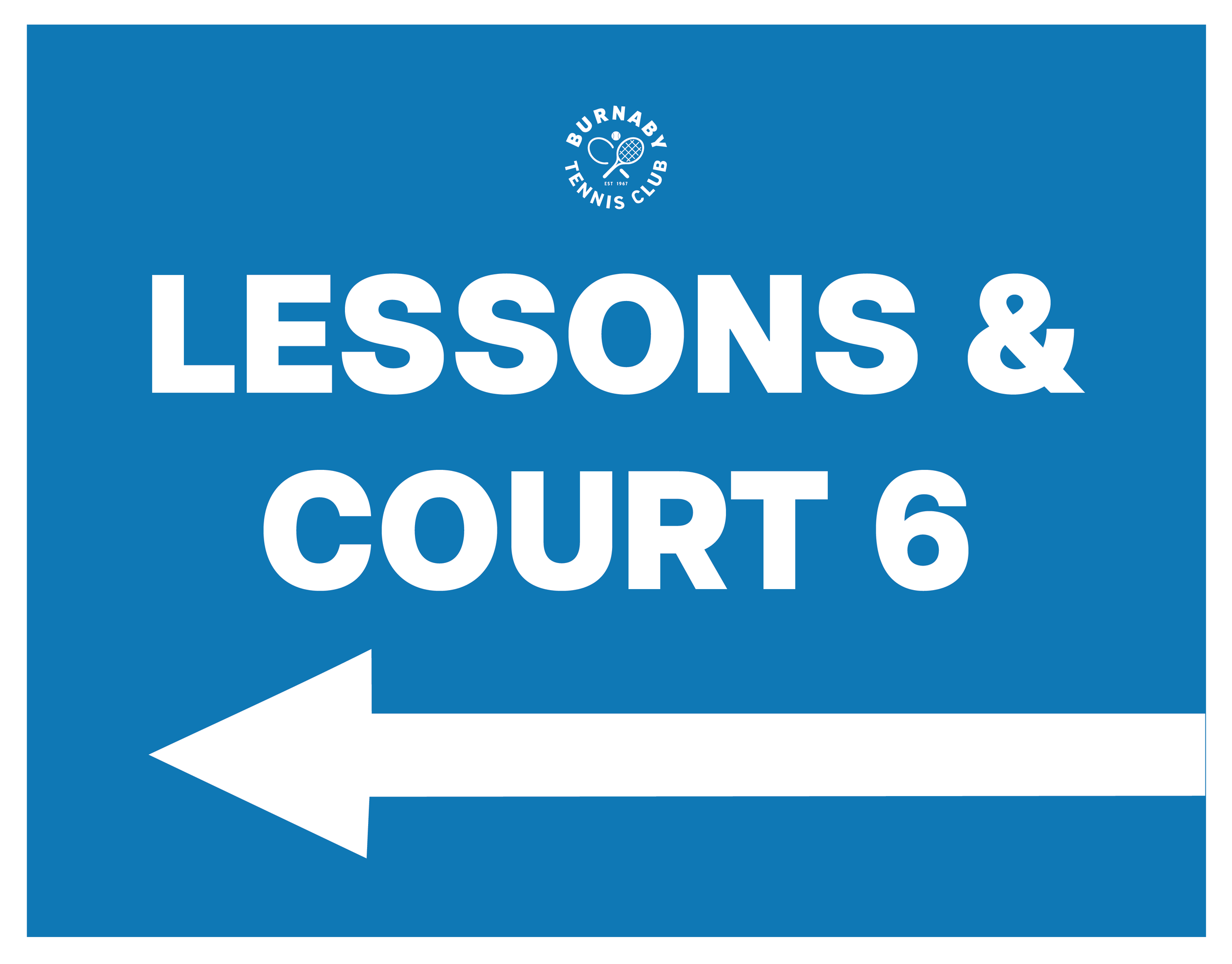
Signage & Print
Signage & Print
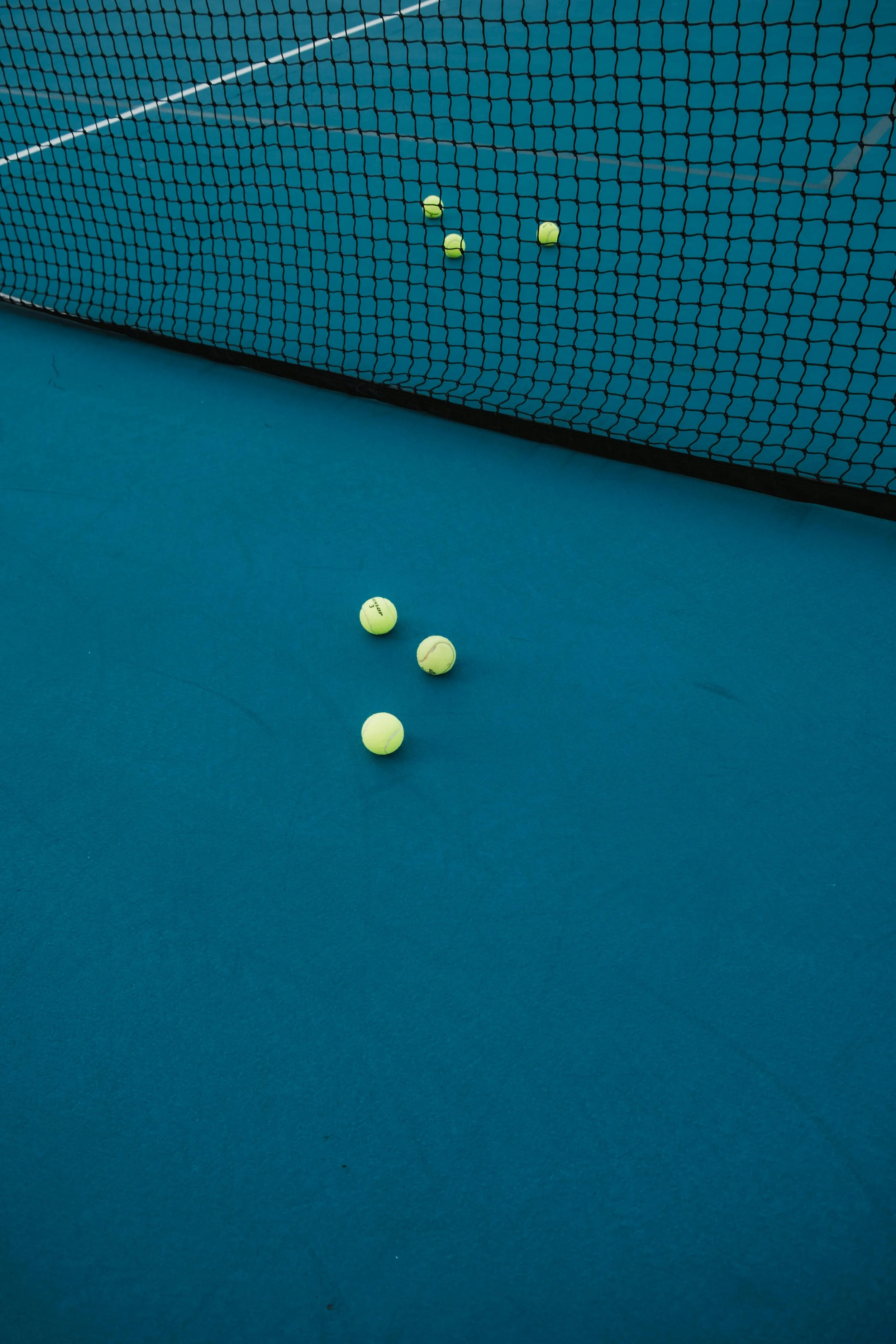
Like any sports club, wayfinding and rule-based signage is extremely important. I created clear systems that are direct and easy to navigate, while successfully carrying the branding across all materials. The result is signage that communicates effectively to the patrons while reinforcing brand identity by creating aesthetic cohesion and brand trust.
Like any sports club, wayfinding and rule-based signage is extremely important. I created clear systems that are direct and easy to navigate, while successfully carrying the branding across all materials. The result is signage that communicates effectively to the patrons while reinforcing brand identity by creating aesthetic cohesion and brand trust.


Let’s Connect?
Got an idea brewing? A brand waiting to bloom? A package that deserves a spot on the shelf? Fill out the form below and tell me what you're dreaming up, I'd love to help bring it to life.