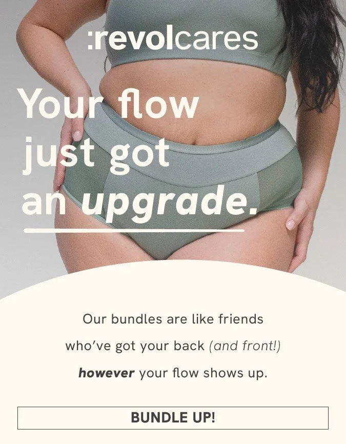
YOUR FLOW JUST GOT AN UPGRADE.
Revol Cares
February 2026 | Ad Campaign Creation | Website assets
Revol Cares invited me to develop a cohesive campaign concept centered around the theme “Your flow just got an upgrade.” The brief called for three distinct digital ads, a mobile-first newsletter, and a supporting landing page banner. The focus was on brand interpretation, creative differentiation across angles, visual hierarchy, and conversion awareness within Revol’s ecosystem.
Campaign creation and tone allignment
3 digital ads, each with a distinct angle/formatting
1 mobile-first newsletter promoting the new launch
1 landing page banner supporting the campaign
BRIEF BREAKDOWN
BRIEF BREAKDOWN
1
2
3
Brand Tone?
Deliverables?
Brand Tone?
CONFIDENT. CHEEKY. LOUD. EMPATHETIC.
Deliverables?
Creative angles?
CONFIDENT. CHEEKY. LOUD. EMPATHETIC.
Campaign creation and tone allignment
3 digital ads, each with a distinct angle/formatting
1 mobile-first newsletter promoting the new launch
1 landing page banner supporting the campaign
Creative angles?
Emotional / Lifestyle Driven
Educational / Intimacy & Trust
Retail Driven / Pack shot
Emotional / Lifestyle Driven
Educational / Intimacy & Trust
Retail Driven / Pack shot
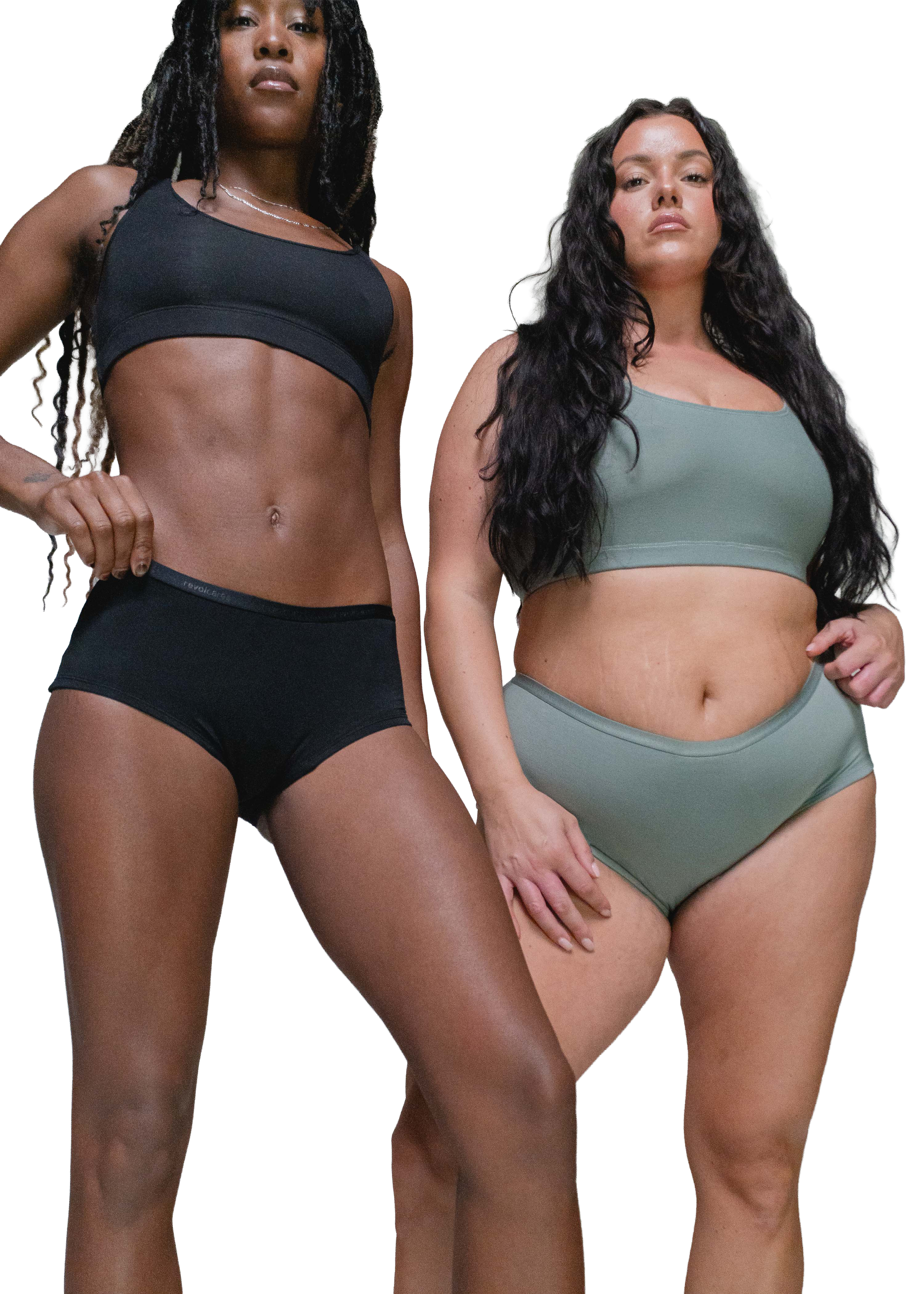
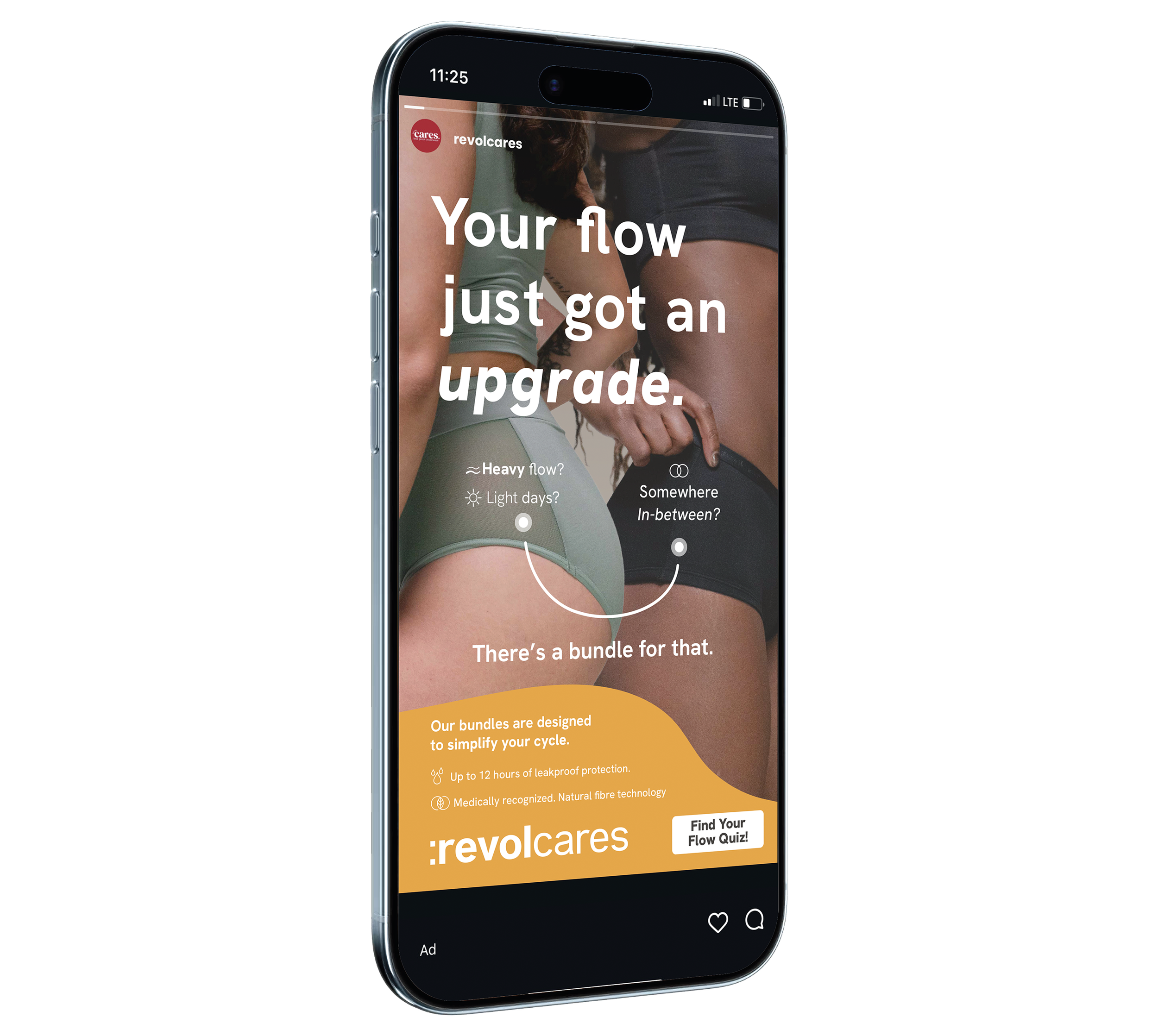
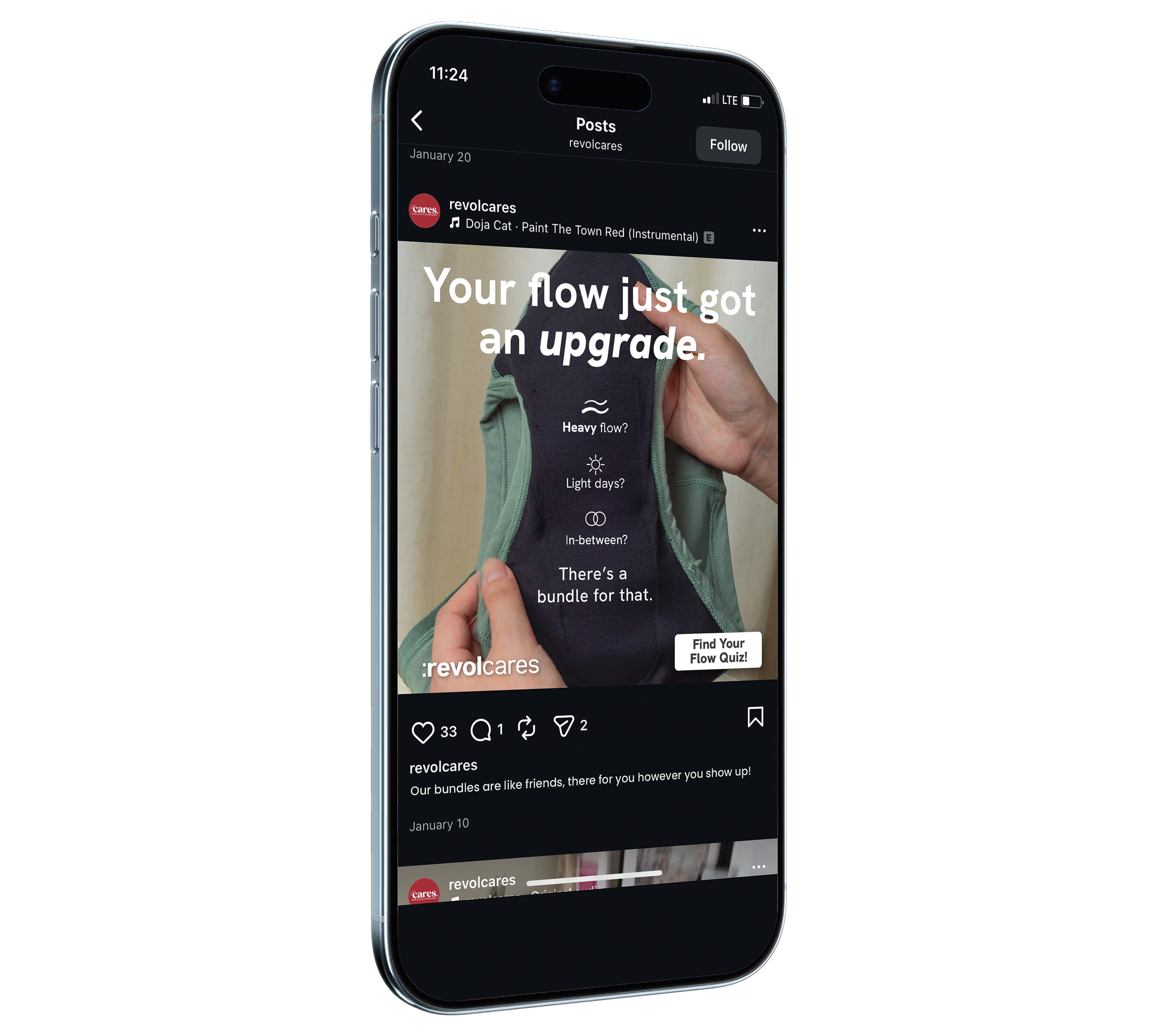
CREATIVE STRATEGY 01: EMOTIONAL/LIFESTYLE
Purpose: Instagram Story Ad | Size:1080px x 1920px
This first concept was designed to showcase body inclusive models wearing the product to evoke a reaction of ‘that could be me’ within the target audience. The goal (and result!) of this strategy is to provide an emotional entry point for the viewer to connect with the product and brand tone, leading to purchase and brand loyalty. Showcasing more than one leakproof underwear instantly communicates the bundle promotion and the variety of products for different flows (Light, heavy, somewhere in-between).

Designed to feel empowering and human, leading with emotion before product details
Anchored messaging around confidence and ease to align with the campaign theme “Your flow just got an upgrade”
Used warm tones and approachable typography to reflect Revol’s inclusive, supportive brand voice
Clear but soft CTA directing users to the quiz as a low-friction next step
Prioritized scroll-stopping hierarchy for paid social

WHY DOES THIS WORK?
WHY DOES THIS WORK?
Designed to feel empowering and human, leading with emotion before product details
Anchored messaging around confidence and ease to align with the campaign theme “Your flow just got an upgrade”
Used warm tones and approachable typography to reflect Revol’s inclusive, supportive brand voice
Clear but soft CTA directing users to the quiz as a low-friction next step
Prioritized scroll-stopping hierarchy for paid social
CREATIVE STRATEGY 02: EDUCATIONAL/INTIMACY & TRUST
Purpose: Instagram Square Post Ad | Size:1080px x 1080px
For this angle, I shifted the focus toward clarity and functional benefits, specifically addressing heavy flow concerns. The copy was structured in digestible tiers to avoid overwhelm while still communicating value and credibility. Stronger hierarchy and intentional spacing guide the eye from headline to benefit to CTA, reinforcing trust through mentions of natural fabrics and medical recognition, while maintaining a tone that feels supportive and friendly. This ad gives off a tactile and intimate feeling.
Shifted focus to product clarity and functional benefits for heavy flows
Structured copy in digestible tiers to avoid overwhelm while still communicating value
Used stronger hierarchy and spacing to guide the eye from headline, to benefit, to Call to Action
Highlighted natural fabrics and medical recognition to build credibility
Balanced warmth with authority to reinforce trust
Showing an intimate part of the underwear, which supports the brand tone of confidence and empathy and disrupts scrolling
WHY DOES THIS WORK?

WHY DOES THIS WORK?
Shifted focus to product clarity and functional benefits for heavy flows
Structured copy in digestible tiers to avoid overwhelm while still communicating value
Used stronger hierarchy and spacing to guide the eye from headline, to benefit, to Call to Action
Highlighted natural fabrics and medical recognition to build credibility
Balanced warmth with authority to reinforce trust
Showing an intimate part of the underwear, which supports the brand tone of confidence and empathy and disrupts scrolling
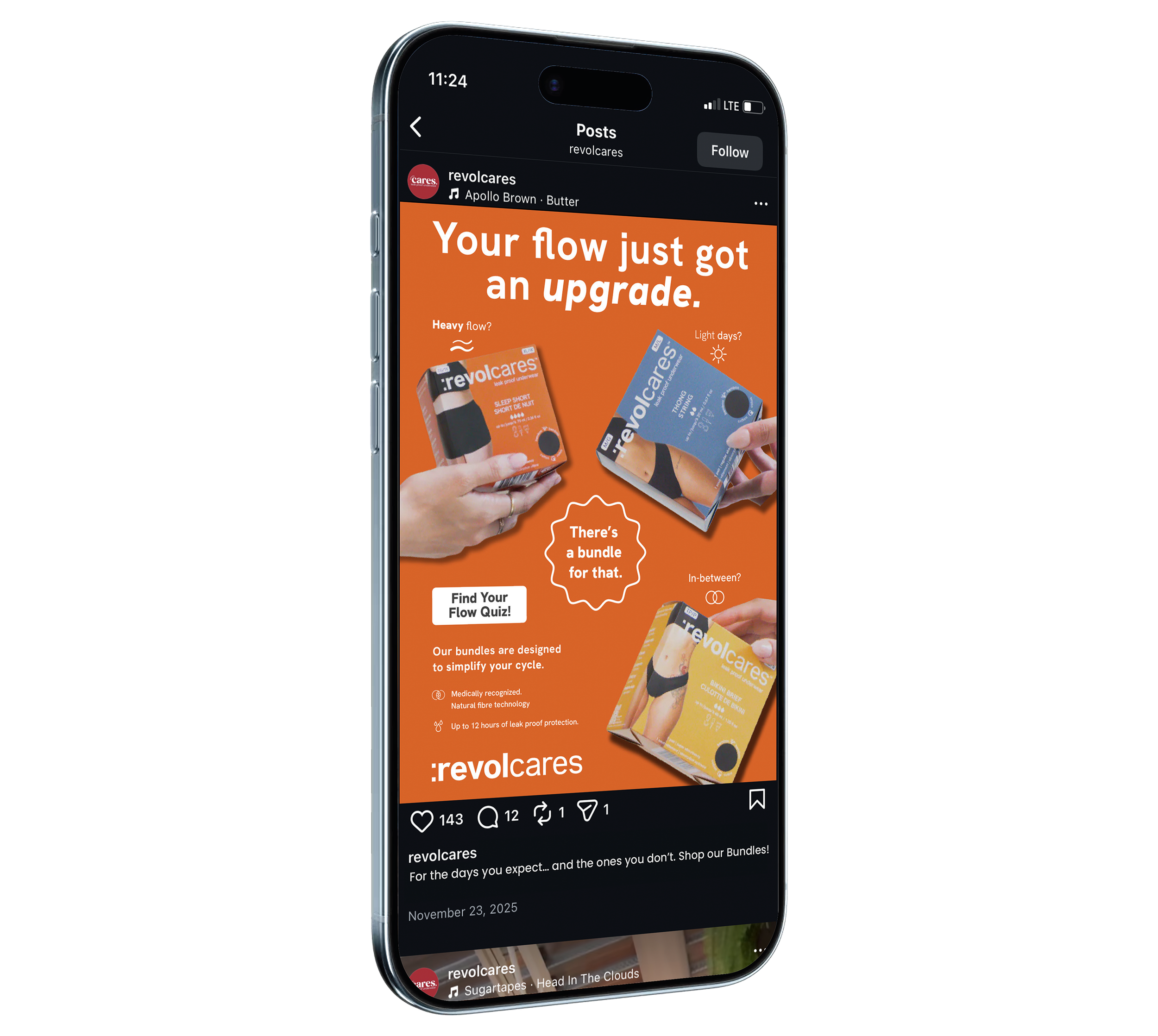
CREATIVE STRATEGY 03: RETAIL DRIVEN / PACK SHOT
Purpose: Instagram Vertical Post Ad | Size:1080px x 1350px
This variation centers on simplifying the purchase decision through bundle clarity. The messaging “There’s a bundle for that” acts as a clear retail hook, while the layout visually groups SKUs to make differences easily scannable. Showing the products packaging makes this feel like a purchasable, recognizable product, creating a more action-oriented execution. While visually consistent with the broader campaign system, this version increases urgency and purchase intent, feeling confident and playful in it’s colours and layout, while maintaining strong hierarchy and clear messaging.
Centered messaging around “There’s a bundle for that” to simplify decision-making
Visually grouped SKUs to make product differences immediately scannable
Reduced supporting copy and increased CTA emphasis to drive action
Designed with mobile-first legibility to support quick purchasing behavior
Created visual consistency with other campaign assets while increasing urgency
Bold and confident use of brand colours and layout hierarchy
WHY DOES THIS WORK?

WHY DOES THIS WORK?
Centered messaging around “There’s a bundle for that” to simplify decision-making
Visually grouped SKUs to make product differences immediately scannable
Reduced supporting copy and increased CTA emphasis to drive action
Designed with mobile-first legibility to support quick purchasing behavior
Created visual consistency with other campaign assets while increasing urgency
Bold and confident use of brand colours and layout hierarchy
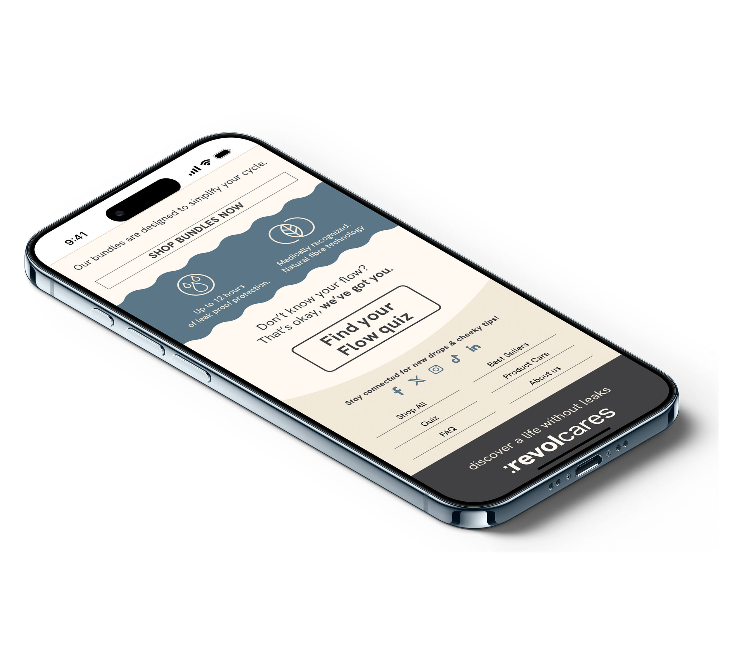
MOBILE FIRST NEWSLETTER
Purpose: E-mail Newsletter Marketing | Size:675px x 3750px
The newsletter was designed as a natural extension of the paid ads and landing page, creating a cohesive campaign system rather than a standalone asset. While the ads focus on capturing attention through distinct angles, the newsletter expands on that initial hook by organizing products by flow type and reinforcing the “Your period just got an upgrade” message in a more informative, conversion-driven format. It bridges awareness and action by guiding readers toward both the bundle purchase option and the Find Your Flow Quiz, mirroring the same hierarchy, tone, and visual language established across social and web touchpoints.
Here, the focus shifts to conversion. The bundle call-to-action provides a straightforward purchase path, while the “Find Your Flow Quiz” offers a lower-commitment entry point for those still in the consideration phase. Presenting both options supports different buyer mindsets within the same ecosystem. The footer reinforces Revol’s community-driven identity by encouraging continued engagement beyond the purchase. Social links are positioned as an extension of the brand experience, maintaining warmth and inclusivity while keeping the design clean.
Here, the focus shifts to conversion. The bundle call-to-action provides a straightforward purchase path, while the “Find Your Flow Quiz” offers a lower-commitment entry point for those still in the consideration phase. Presenting both options supports different buyer mindsets within the same ecosystem. The footer reinforces Revol’s community-driven identity by encouraging continued engagement beyond the purchase. Social links are positioned as an extension of the brand experience, maintaining warmth and inclusivity while keeping the design clean.
The header introduces the campaign with cheeky, confidence-forward copy to immediately capture attention and reinforce Revol’s approachable brand voice. The goal was to feel empowering rather than clinical, aligning with the “Your period just got an upgrade” message while setting a friendly, conversational tone for the rest of the email.
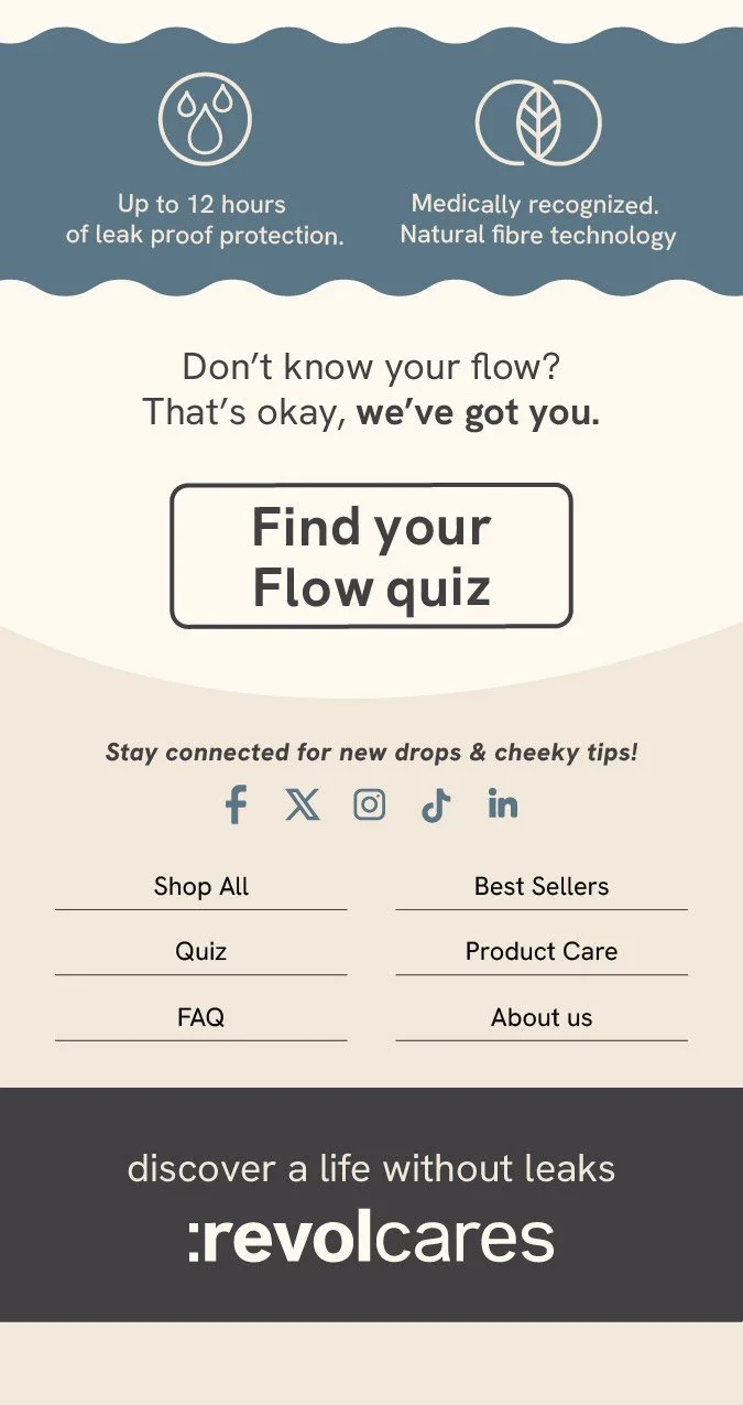
QUIZ CTA SECTION + SOCIAL & COMMUNITY FOOTER
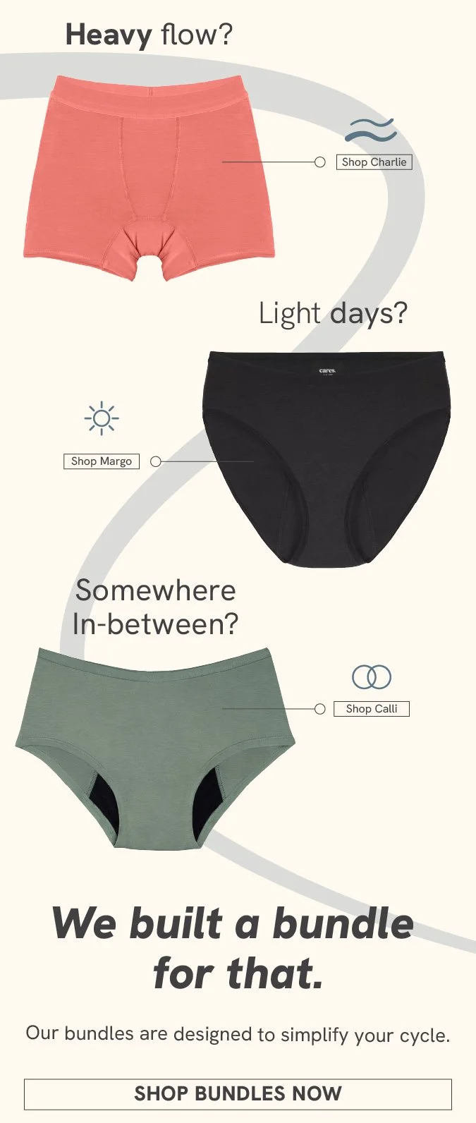
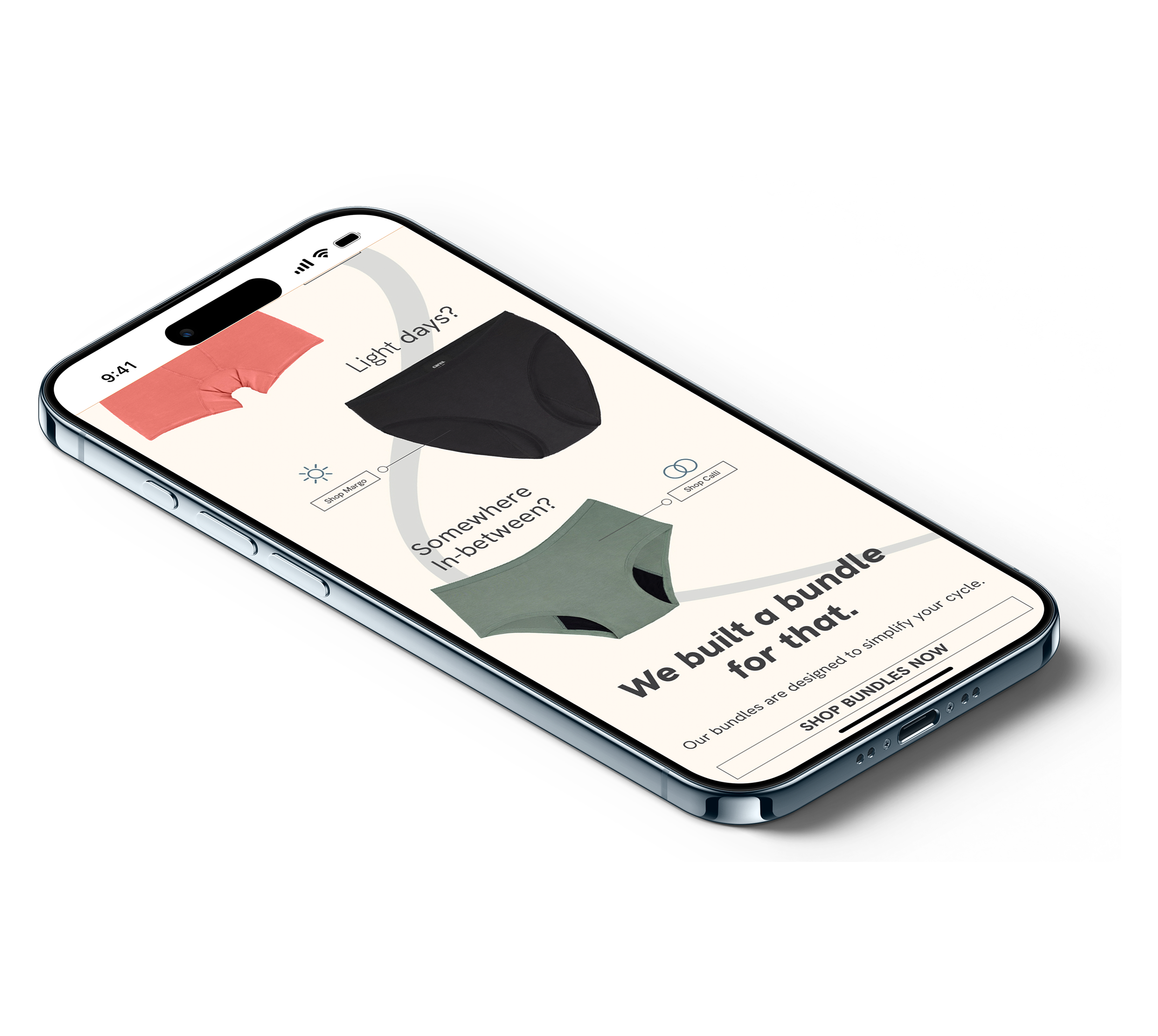
Product Showcase & Flow-Based Navigation
INTRO HEADER OF NEWSLETER
INTRO HEADER OF NEWSLETER


The header introduces the campaign with cheeky, confidence-forward copy to immediately capture attention and reinforce Revol’s approachable brand voice. The goal was to feel empowering rather than clinical, aligning with the “Your period just got an upgrade” message while setting a friendly, conversational tone for the rest of the email.
Product Showcase & Flow-Based Navigation
This section organizes products by flow type: heavy, light, and somewhere in between. Structuring the content this way simplifies decision-making and mirrors how customers actually shop for period care. Clear hierarchy and concise benefit-driven copy help guide readers toward the bundle call-to-action while keeping the layout mobile-friendly and easy to scan.
QUIZ CTA SECTION + SOCIAL & COMMUNITY FOOTER
Here, the focus shifts to conversion. The bundle call-to-action provides a straightforward purchase path, while the “Find Your Flow Quiz” offers a lower-commitment entry point for those still in the consideration phase. Presenting both options supports different buyer mindsets within the same ecosystem.
The footer reinforces Revol’s community-driven identity by encouraging continued engagement beyond the purchase. Social links are positioned as an extension of the brand experience, maintaining warmth and inclusivity while keeping the design clean.
This section organizes products by flow type: heavy, light, and somewhere in between. Structuring the content this way simplifies decision-making and mirrors how customers actually shop for period care. Clear hierarchy and concise benefit-driven copy help guide readers toward the bundle call-to-action while keeping the layout mobile-friendly and easy to scan.


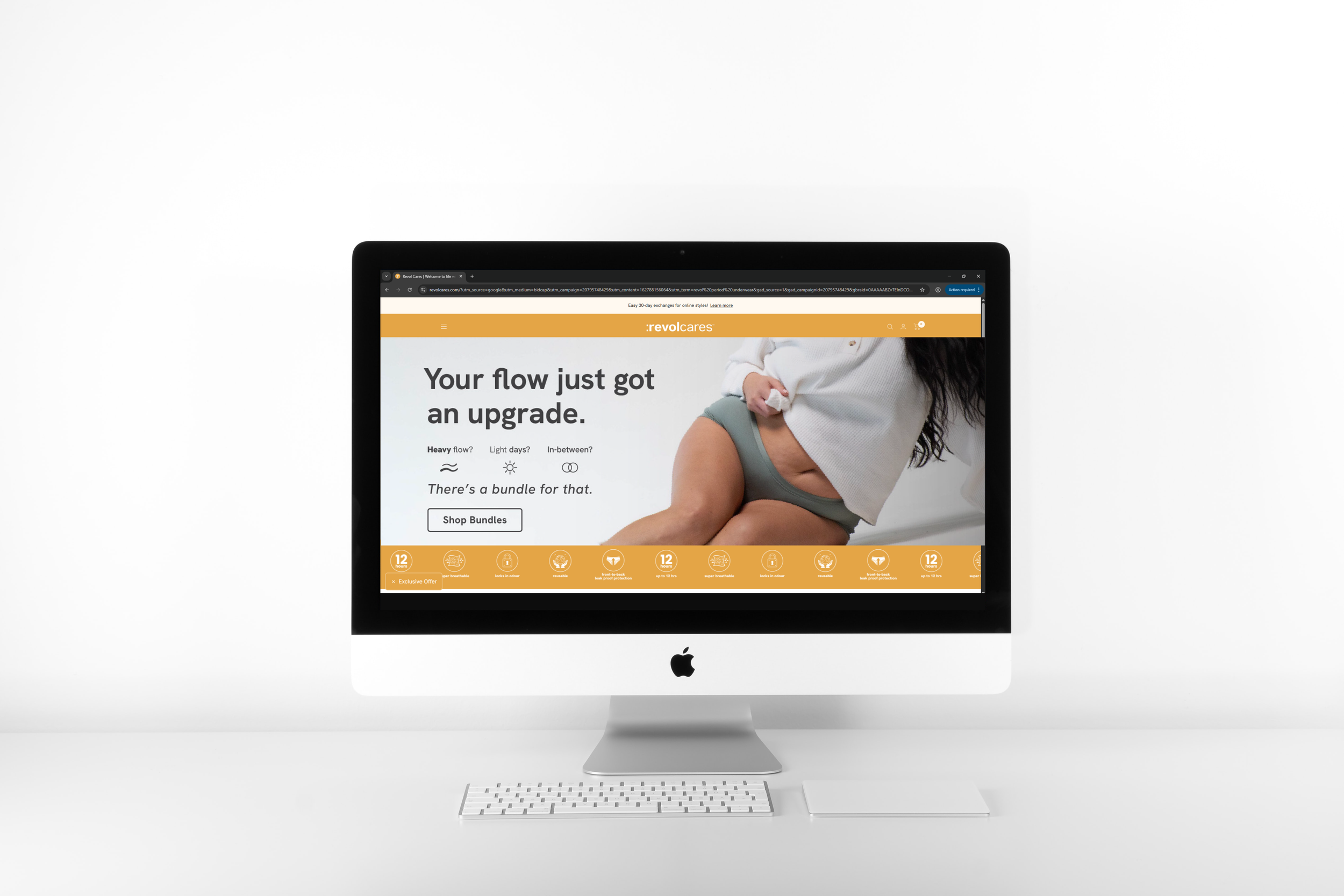
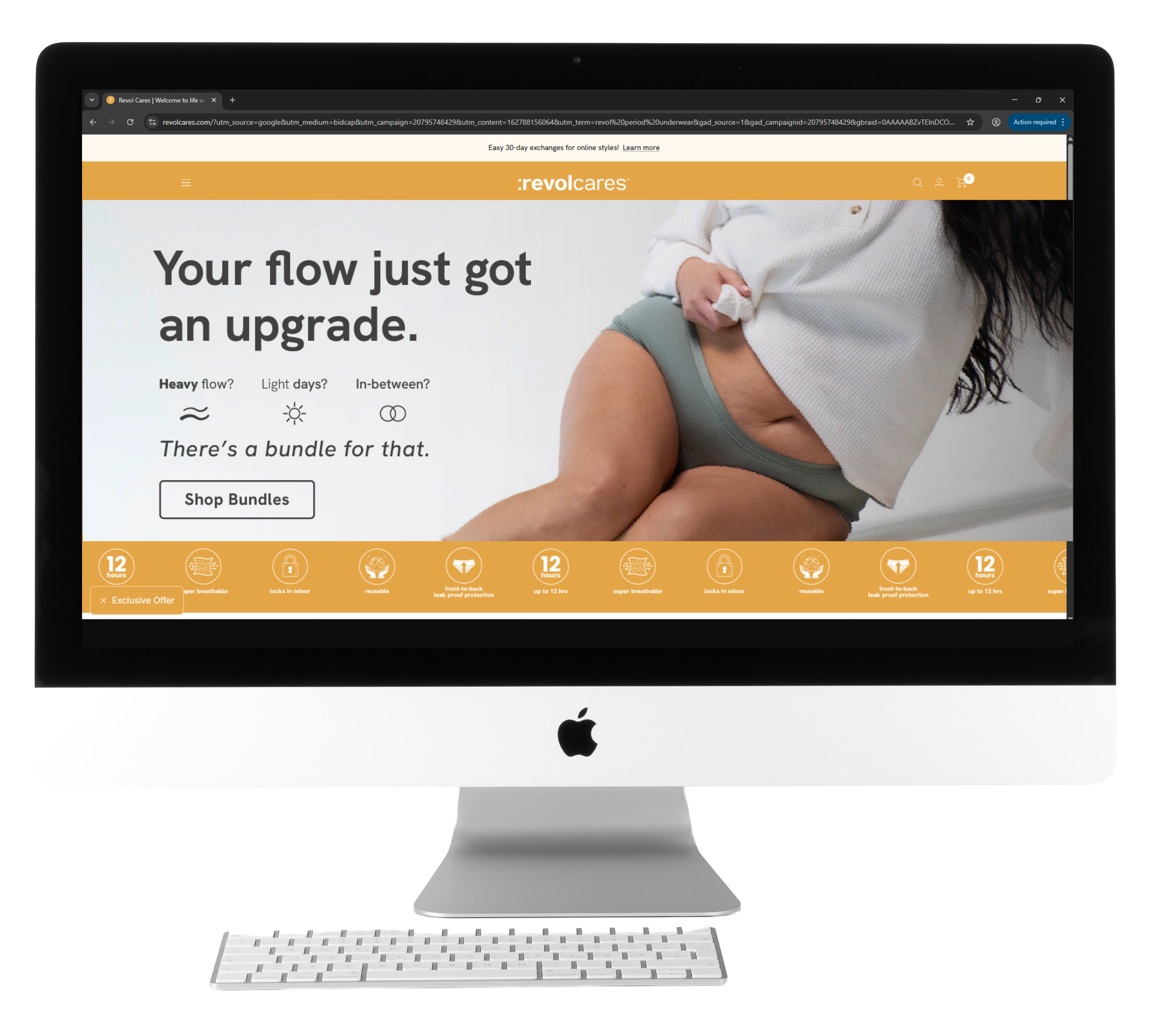
LANDING PAGE WEBSITE BANNER
Purpose: Website asset supporting bundle campaign | Size:1328px x 458px
The landing page was designed to support and strengthen the campaign by translating the ad messaging into a conversion-focused environment. Building on the “Your period just got an upgrade” theme, the layout prioritizes clear hierarchy, product clarity, and guided decision-making. The banner reinforces the campaign hook, while the supporting sections provide deeper education around flow types, bundles, and benefits without overwhelming the user.
WHY DOES THIS WORK?
Reinforces the same campaign hook from paid ads, creating continuity across touchpoints
Expands messaging in a structured, scannable format suited for web behavior
Uses clear hierarchy to guide users from headline to education to action
Balances emotional tone with product clarity to build both trust and urgency
Supports multiple conversion paths, including direct bundle purchase and the Find Your Flow Quiz
Designed mobile-first to align with traffic coming from social ads and email
Maintains visual and tonal consistency with the broader campaign system
Let’s Connect!
Got an idea brewing? A brand waiting to bloom? A package that deserves a spot on the shelf? Fill out the form below and tell me what you're dreaming up, I'd love to help bring it to life.